Start/End tick label are incorrect for the Bar chart.
- Dominant language
- TypeScript
- Stars
- 67.3k
- Forks
- 19.8k
- Avg merge
- 11d 14h
- Merged PRs (30d)
- 8
Description
### Version
5.1.2
### Reproduction link
[https://codesandbox.io/s/bar-chart-tick-label-eqzh7?file=/src/barChartData.js](https://codesandbox.io/s/bar-chart-tick-label-eqzh7?file=/src/barChartData.js)
### Steps to reproduce
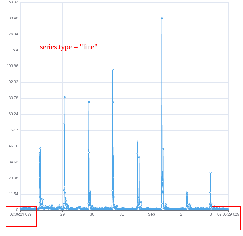
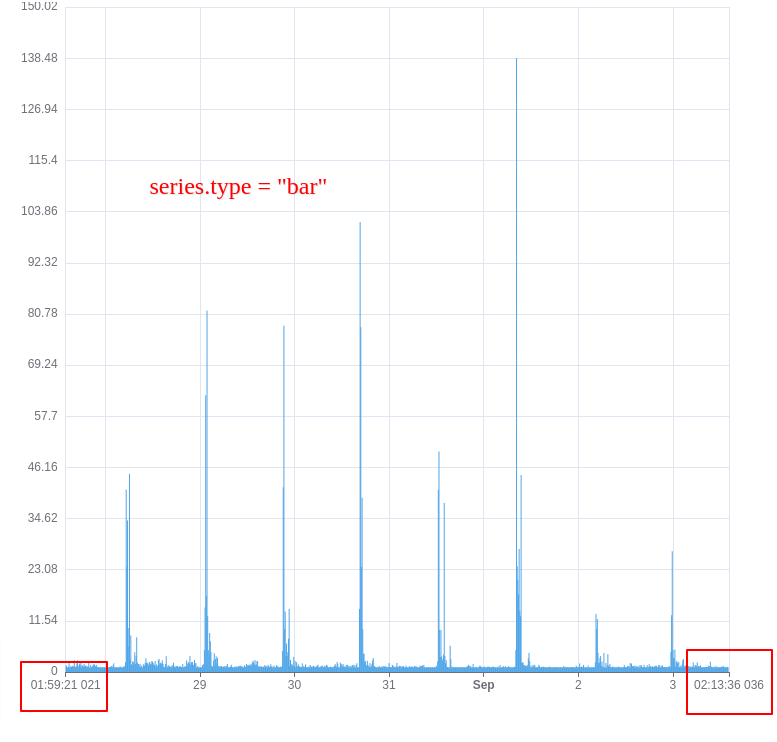
Created a time series graph with line and bar visualization. With the line chart, the xAxis tick labels are correct, as in as per the max/min and the data provided. But for the bar chart, the start/end labels are not correct.
In the sandbox link provided, try changing the series.tyle to "line", you'll see the correct time label in the chart.
### What is expected?
The min/max axis label should be the same for the bar and the line chart with the same data and options.
### What is actually happening?
The min/max labels are not correct when the type is "bar".
Contributor guide
Assessment
This issue has not been assessed yet.