小提琴图轮廓线的设置🥰 [FEATURE]
- Dominant language
- TypeScript
- Stars
- 2.7k
- Forks
- 591
- PR merge metrics
- No merged PRs in 30d
Description
### 🥰 Features description [Please make everyone to understand it]
小提琴图轮廓线核函数算法里:
/** 最小值,默认为数据中的最小值减去一个固定的阈值。 */
min?: number;
/** 最大值,默认为数据中的最大值加上一个固定的阈值。 */
max?: number;
轮廓线的最大值和最小值都会加上和减去一个固定值,使得轮廓线超出原本数据的最大和最小值许多。
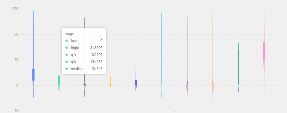
例如这里代表百分比的数据,最小值为0,最大为100【0~100】。而图中轮廓线明显超出了这个值,使得Y轴刻度也发生了变化【-40~120】。
请问能否提供一种计算方法是不加这个固定阈值的,使得密度线的最大最小和真实数据一致呢?
Contributor guide
Research direction
The issue names no files or tests. Start by locating the violin plot contour or kernel-density implementation and the existing min/max options; compare its current bounds with the requested data range. Done means providing a way for the contour bounds to match the real minimum and maximum values without the fixed threshold, with the violin plot’s axis no longer extending beyond that range.
Written by the indexing model from the issue text.
Assessment
- Tech stack
- typescript
- Domain
- data-visualization
- Issue type
- Feature
- Difficulty
- 3/5
- Estimated time
- 1-2 days
- Activity status
- Stale
- Clarity
- Mostly clear
- Newbie friendliness
- 42/100