ant-design / ant-design/pro-components
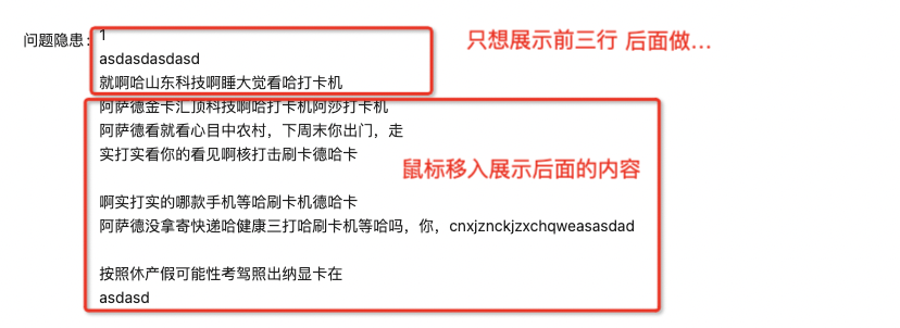
👑 [需求] ProFormTextArea 在readonly 情况下增加一个显示几行的配置
- Dominant language
- TypeScript
- Stars
- 4.8k
- Forks
- 1.4k
- Avg merge
- 10h 44m
- Merged PRs (30d)
- 3
Description
提问前先看看:
https://github.com/ryanhanwu/How-To-Ask-Questions-The-Smart-Way/blob/main/README-zh_CN.md
### 🔩 所属模块或组件
ProFormTextArea
### 🥰 需求描述
ProFormTextArea 在readonly 情况下增加一个显示几行配置,超出后鼠标移入就显示Tooltip
### ⛰ 功能需求适用场景
在文本域中输入太多信息的时候,页面会被撑开,此时为了展示美观需要用到此功能
### 🧐 解决方案
### 🚑 其他信息
Contributor guide
Research direction
Start by locating the ProFormTextArea implementation and its existing readonly behavior. Read nearby component tests, if present, to understand current rendering and determine how the configurable row count and hover tooltip should be verified. Done means readonly text can be limited to the configured number of rows while longer content is available on hover.
Written by the indexing model from the issue text.
Assessment
- Tech stack
- react, typescript
- Domain
- frontend
- Issue type
- Feature
- Difficulty
- 3/5
- Estimated time
- 1-2 days
- Activity status
- Stale
- Clarity
- Mostly clear
- Newbie friendliness
- 35/100