Add feature to visualize Cell Quality distribution for a quality measure
- Dominant language
- Python
- Stars
- 35
- Forks
- 14
- Avg merge
- 3d 5h
- Merged PRs (30d)
- 11
Description
### 📝 Description of the feature
The tool is to help visualize the cell quality distribution of a volume mesh generated. The function must take the quality parameter , quality range, scope as input and number of divisions. Bar charts can be used to visualize the data generated from
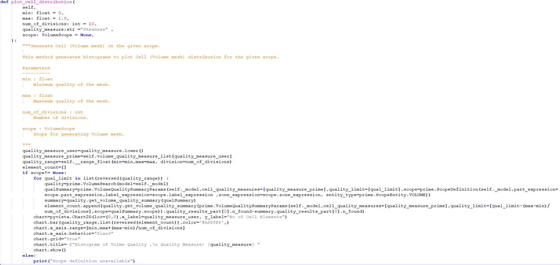
### 💡 Steps for implementing the feature
1. ``def plot_cell_distribution(
self,
min: float = 0,
max: float = 1.0,
num_of_divisions: int = 10,
quality_measure:str ="Skewness" ,
scope: VolumeScope = None,
):
"""Generate Cell (Volume mesh) on the given scope.
This method generates histograms to plot Cell (Volume mesh) distribution for the given scope.
Parameters
----------
min : float
Minimum quality of the mesh.
max : float
Maximum quality of the mesh.
num_of_divisions : int
Number of divisions.
scope : VolumeScope
Scope for generating Volume mesh.
"""
quality_measure_user=quality_measure.lower()
quality_measure_prime=self.volume_quality_measure_list[quality_measure_user]
quality_range=self.__range_float(min=min,max=max, division=num_of_divisions)
element_count=[]
if scope!= None:
for qual_limit in list(reversed(quality_range)) :
quality=prime.VolumeSearch(model=self._model)
qualSummary=prime.VolumeQualitySummaryParams(self._model,cell_quality_measures=[quality_measure_prime],quality_limit=[qual_limit],scope=prime.ScopeDefinition(self._model,part_expression=scope.part_expression,label_expression=scope.label_expression ,zone_expression=scope.zone_expression, entity_type=prime.ScopeEntity.VOLUME))
summary=quality.get_volume_quality_summary(qualSummary)
element_count.append(quality.get_volume_quality_summary(prime.VolumeQualitySummaryParams(self._model,cell_quality_measures=[quality_measure_prime],quality_limit=[qual_limit-(max-min)/num_of_divisions],scope=qualSummary.scope)).quality_results_part[0].n_found-summary.quality_results_part[0].n_found)
chart=pyvista.Chart2D(loc=(0,0),x_label=quality_measure_user, y_label="No of Cell Elements")
chart.bar(quality_range,list(reversed(element_count)),color='#ADD8E6',)
chart.x_axis.range=[min,max+(max-min)/num_of_divisions]
chart.x_axis.behavior="fixed"
chart.grid="True"
chart.title= f"Histogram of Volme Quality ,\n Quality Measure: {quality_measure} "
chart.show()
else:
print("Scope definition unavailable")
``
### 🔗 Useful links and references
_No response_
Contributor guide
Research direction
No file or test is named in the issue. Start from the proposed plot_cell_distribution entry point and review the VolumeSearch, VolumeQualitySummaryParams, quality-measure mapping, and PyVista Chart2D usage shown. Done means a scoped volume-mesh quality distribution is plotted with the requested measure, range, divisions, labels, and bar-chart output.
Written by the indexing model from the issue text.
Assessment
- Tech stack
- python
- Domain
- data-visualization
- Issue type
- Feature
- Difficulty
- 4/5
- Estimated time
- 3-5 days
- Activity status
- Stale
- Clarity
- Mostly clear
- Newbie friendliness
- 38/100