adobe-fonts / adobe-fonts/source-han-sans
Improve design of 朝 (uni671DuE0101-JP) variant glyph
Open
design
- Dominant language
- Python
- Stars
- 17.2k
- Forks
- 1.4k
- PR merge metrics
- No merged PRs in 30d
Description
The two drop strokes (點) in 月 should preferably be centralized. Only the ExtraLight weight should be adjusted, Heavy weight is fine.
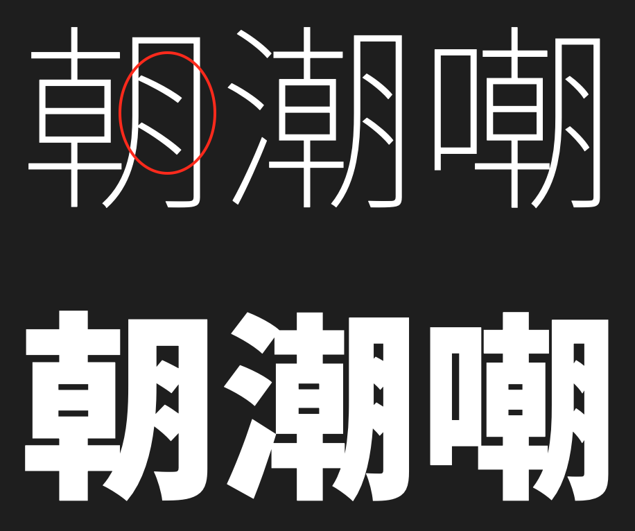
**EDIT 2:** Also applies to Serif, but I have made a separate post as automatically linked below.
**EDIT 3:** Kozuka Gothic also affected.
Contributor guide
No contributing guide indexed for this repository
Assessment
This issue has not been assessed yet.