adobe-fonts / adobe-fonts/source-han-sans
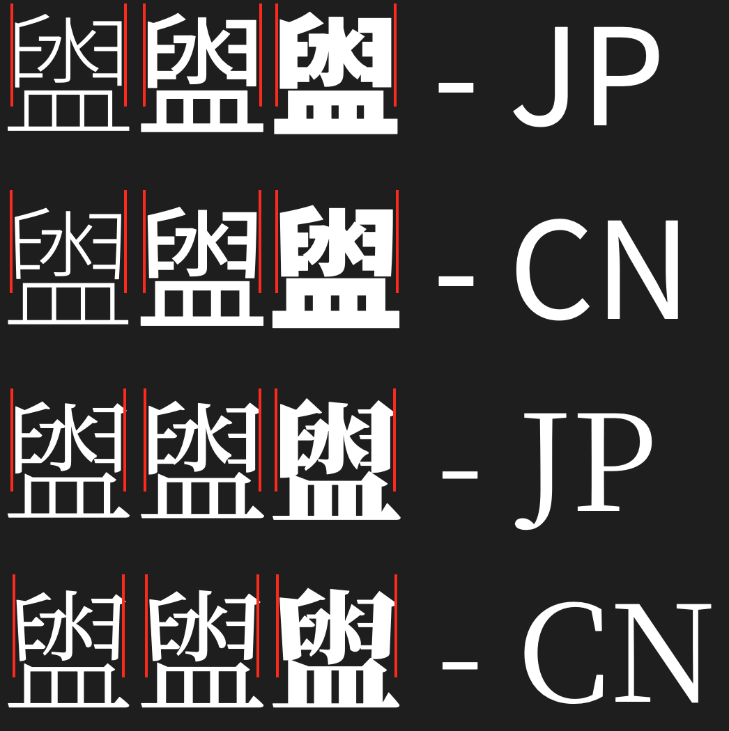
Adjust glyph in 盥 (U+76E5, JP only)
- Lenguaje dominante
- Python
- Estrellas
- 17.2k
- Forks
- 1.4k
- Métricas de merge de PR
- Sin PR fusionados en 30 d
Descripción
Applies to both Sans and Serif.
Should we standardize on whether to have a slight angle or completely vertical strokes in the split 臼 part for CN and JP? It's understandable that for optical reasons the split 臼 part is angled. Likely a matter of design choice.
Here are some of the Chinese fonts on my Mac as a reference. Some are straight while others are slightly angled (marked in yellow).

The font list is (from left to right): STHeiti (Light and Regular), Songti SC (Light and Regular), Lantinghei SC, Apple LiGothic, Apple LiSung, LiHei Pro, LiSong Pro, Yuanti SC, Pingfang SC and SimSong (not to be confused with SimSun for Windows)
And here are the Japanese fonts. Notice most of them are also angled, only Adobe's fonts (Heisei and Kozuka series) are not.

The font list is (from left to right): Osaka (Heisei Gothic), Hiragino Kaku Gothic, Hiragino Maru Gothic, Hiragino Mincho, Kozuka Gothic, Kozuka Mincho, Toppan Bunkyu Gothic, Toppan Bunkyu Mincho, Tsukushi A Round Gothic, YuGothic and YuMincho
Guía de contribución
No hay ninguna guía de contribución indexada para este repositorio
Evaluación
Este issue todavía no se ha evaluado.