Unsupported network UI redesign
Nobody has claimed this yet.
- Dominant language
- TypeScript
- Stars
- 5.5k
- Forks
- 5.4k
- PR merge metrics
- No merged PRs in 30d
Description
When you connect with an unsupported network you see this

the Connect wallet button in the swap box is inaccurate because your wallet is already connected.
When you click on that button you see this message which feels like a dead end. How is the user supposed to know what an appropriate network is, or how to connect to it?
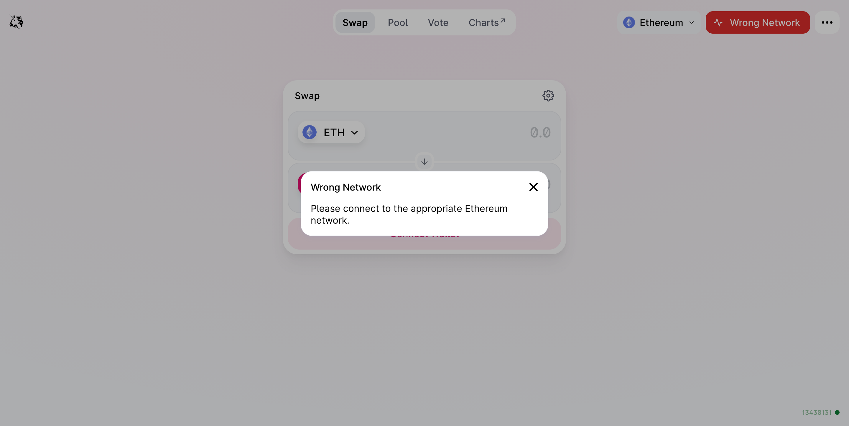
@maggievalentine can you propose a design? Options
- Rename the button to "Wrong network" (should we soften this language to "Unsupported network"?) and force open the network selector in the top-right corner. Make that network menu non-dismissable until the user clicks a supported network.
- Rename the button to "Switch networks" (what color should that button be?) and when clicked open the dropdown network selector in the top-right? This is an awkward pattern.
- (same) .. when clicked open a modal with our networks to choose from? This would be a duplicate of the network selector functionality
Contributor guide
First steps
- Read the whole issue, then the project's contributing guide.
- Comment on the issue to say you are picking it up — it saves two people doing the same work.
- Fork the repository and make your change on a branch.
- Open a pull request that references the issue number.
Research direction
No files, tests, or entry points are named. First resolve the proposed network-selection UX and button wording with maintainers, then locate the existing unsupported-network and network-selector UI. Done means an agreed design is implemented and the unsupported-network flow no longer leaves users at a dead end.
Written by the indexing model from the issue text.
Assessment
- Tech stack
- blockchain, typescript
- Domain
- blockchain, frontend
- Issue type
- Feature
- Difficulty
- 5/5
- Estimated time
- Over a week
- Activity status
- Stale
- Clarity
- Needs clarification
- Newbie friendliness
- 25/100