StackExchange / StackExchange/Stacks
Style problem in docs with banners
Open
Nobody has claimed this yet.
bug
docs
- Dominant language
- TypeScript
- Stars
- 672
- Forks
- 107
- Avg merge
- 2d 12h
- Merged PRs (30d)
- 26
Description
Actually there are 2 bugs:
- When hovering on close button in the example of important banner, the cross icon stays white and becomes undistinguished from hovered background
- Navigating to another page with opened Pinned banner leaves empty space
Steps to reproduce the behaviour:
- Go to banners doc page
- Scroll down to the end
- Select checkboxes "Important?" and "Pinned?"
- Click on "Show example"
- Hover over close button of the banner
- See error of white icon on white background
- Navigate from left sidebar to another page of the docs
- Scroll down a bit
- See error of blank space left behind the banner
Expected behavior
I'd expect to not have this bugs:)
Screenshots
1.

2.
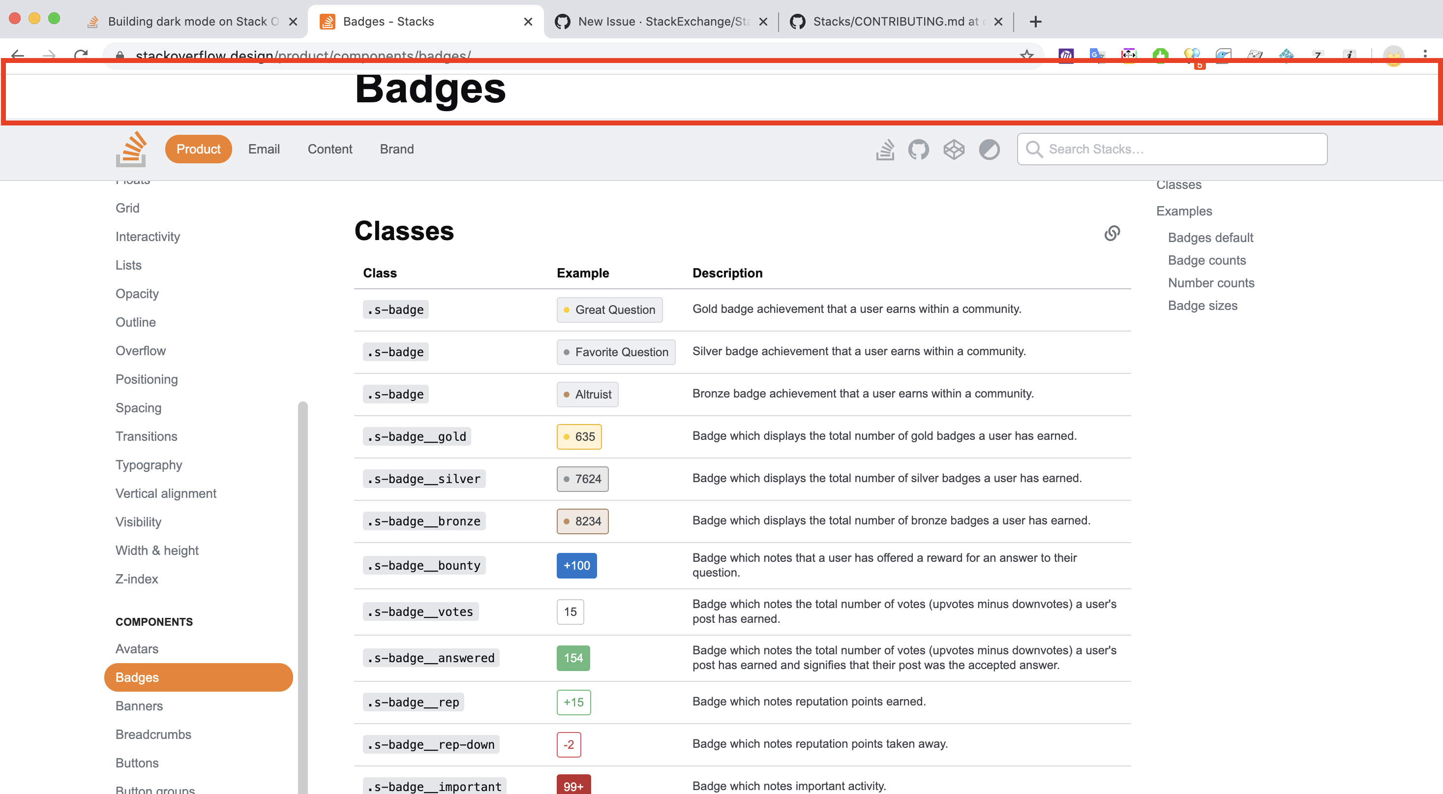
Desktop (please complete the following information):
- OS: macOS
- Browser chrome
- Version 81
Contributor guide
First steps
- Read the whole issue, then the project's contributing guide.
- Comment on the issue to say you are picking it up — it saves two people doing the same work.
- Fork the repository and make your change on a branch.
- Open a pull request that references the issue number.
Research direction
Start at the banners documentation page and reproduce both issues using the listed checkbox, hover, and navigation steps. Inspect the banner example and its behavior across documentation-page navigation; done means the close icon remains distinguishable on hover and no empty space remains after leaving a pinned banner.
Written by the indexing model from the issue text.
Assessment
- Tech stack
- typescript
- Domain
- frontend
- Issue type
- Bug
- Difficulty
- 3/5
- Estimated time
- 1-2 days
- Activity status
- Stale
- Clarity
- Mostly clear
- Newbie friendliness
- 35/100