SSWConsulting / SSWConsulting/SSW.Website
✨ Mobile Layout - Resize and reposition homepage sections for mobile view
Nobody has claimed this yet.
- Dominant language
- HTML
- Stars
- 14
- Forks
- 10
- Avg merge
- 13h 51m
- Merged PRs (30d)
- 38
Description
Requested by: Larry Carland via YakShaver.ai 🦬
cc: Larry Carland, @isaaclombardssw, @babakamyljanovssw
Hi Team!
🟥 Watch the video (2 min 15 sec)
Url from screen share: https://ssw.com.au
Pain
Improve the mobile responsiveness of the SSW Website homepage by reducing oversized content sections and optimizing the layout for easier scrolling and readability on smaller screens. Requested updates include resizing tiles, adjusting video proportions to a more landscape-oriented display, repositioning the rotating banner higher on the page, and improving the event section layout by enlarging and repositioning the countdown timer.
Acceptance Criteria
- Homepage tiles are resized appropriately for mobile devices to reduce excessive vertical scrolling.
- Video sections display in a more landscape-oriented ratio on mobile view.
- Case study tiles and other content tiles are resized consistently for improved mobile readability.
- The rotating banner is repositioned higher on the homepage, above the 'SSW Difference' section.
- The event section is optimized for mobile layout.
- The countdown timer in the event section is enlarged and displayed prominently at the top of the event tile.
- Spacing and sizing across homepage sections are visually balanced and responsive on common mobile screen sizes.
- Changes do not negatively impact desktop or tablet layouts.
Screenshot
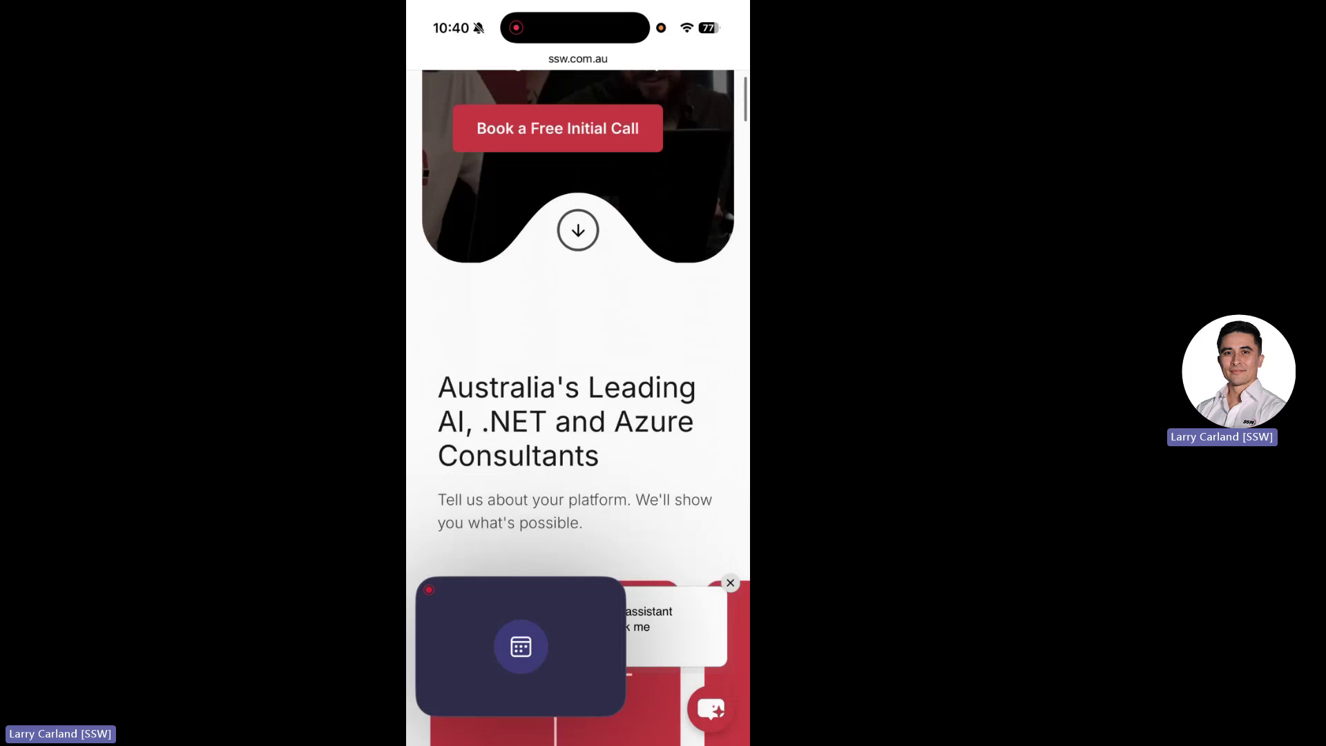
Figure: Mobile homepage tiles oversized
Contributor guide
No contributing guide indexed for this repository
First steps
- Read the whole issue, then the project's contributing guide.
- Comment on the issue to say you are picking it up — it saves two people doing the same work.
- Fork the repository and make your change on a branch.
- Open a pull request that references the issue number.
Research direction
Start at the homepage entry point in the Next.js site and inspect the mobile layout for the tiles, video sections, rotating banner, and event section described in the acceptance criteria. Use the linked screenshot and verify the resized, repositioned sections on common mobile sizes without changing desktop or tablet layouts.
Written by the indexing model from the issue text.
Assessment
- Tech stack
- html, nextjs
- Domain
- design, frontend, web-dev
- Issue type
- Feature
- Difficulty
- 4/5
- Estimated time
- 3-5 days
- Activity status
- Quiet
- Clarity
- Mostly clear
- Newbie friendliness
- 55/100