SSWConsulting / SSWConsulting/SSW.Website
✨ Header Actions - Improve icon sizing, spacing, tooltips, and search styling
Nobody has claimed this yet.
- Dominant language
- HTML
- Stars
- 14
- Forks
- 10
- Avg merge
- 13h 51m
- Merged PRs (30d)
- 38
Description
Requested by: @tiagov8 via YakShaver.ai 🦬
cc: @isaaclombardssw, @tiagov8, @designbyalex, @joshbermanssw, @babakamyljanovssw
Hi Team!
🟥 Watch the video (2 min 51 sec)
Url from screen share: https://ssw.com.au
Pain
Update the header action buttons on ⭐ SSW Website (Dev - Next.js) to improve visual consistency and usability. Reduce the size of the search, global websites, and light/dark mode SVG icons. Fix inconsistent spacing around the separator and the "Let's Talk" button by using consistent gap spacing instead of fixed button sizing. Add optional tooltips for the header action icons to improve discoverability. Update the search box styling to include a visible border, especially in dark mode where it currently blends into the background. Review the global websites dropdown and add the main ssw.com link (or label it as "Americas" and link to ssw.com).
Acceptance Criteria
- The search, global websites, and light/dark mode icons are visually smaller and proportionally consistent with the header layout.
- Spacing between the separator and adjacent buttons is symmetrical on both sides.
- Header action spacing uses consistent gap-based layout styling instead of relying on fixed button sizes.
- Hovering over the header action icons displays descriptive tooltips such as "Search", "Other Sites", and "Toggle Theme".
- The search input has a visible border in both light mode and dark mode.
- The search input is clearly distinguishable from the page background in dark mode.
- The global websites dropdown includes a link to ssw.com or an appropriately labelled equivalent such as "Americas".
- UI changes are responsive and do not negatively impact the mobile or desktop header layout.
Screenshot
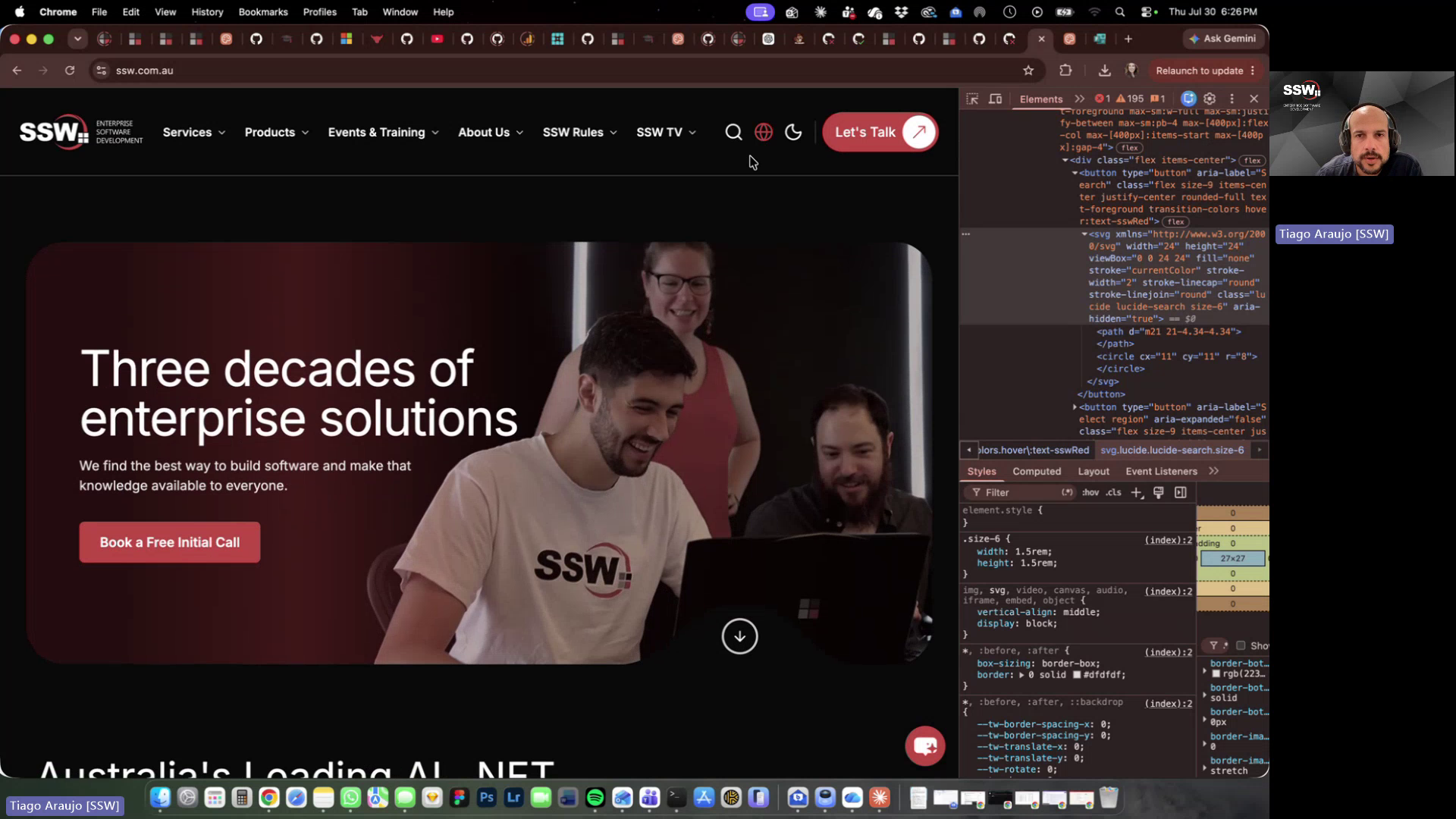
Figure: Header icon button sizing and spacing
Contributor guide
No contributing guide indexed for this repository
First steps
- Read the whole issue, then the project's contributing guide.
- Comment on the issue to say you are picking it up — it saves two people doing the same work.
- Fork the repository and make your change on a branch.
- Open a pull request that references the issue number.
Research direction
Start by locating the Next.js header action components and their responsive styling, then compare the current layout with the linked screenshot and acceptance criteria. Check how the search field, theme and site icons, tooltips, separator spacing, and global-sites dropdown are implemented. Done means the requested visual, tooltip, border, link, and responsive behaviors work in light and dark modes on desktop and mobile.
Written by the indexing model from the issue text.
Assessment
- Tech stack
- nextjs
- Domain
- design, frontend
- Issue type
- Feature
- Difficulty
- 3/5
- Estimated time
- 1-2 days
- Activity status
- Quiet
- Clarity
- Mostly clear
- Newbie friendliness
- 58/100