SSWConsulting / SSWConsulting/SSW.Website
✨ Navigation & Hover States - Improve website hover effects, spacing, and icon consistency
Nobody has claimed this yet.
- Dominant language
- HTML
- Stars
- 14
- Forks
- 10
- Avg merge
- 13h 51m
- Merged PRs (30d)
- 38
Description
Requested by: @tiagov8 via YakShaver.ai 🦬
cc: @tiagov8, @isaaclombardssw, @babakamyljanovssw @joshbermanssw @designbyalex
Hi Team!
🟥 Watch the video (3 min 23 sec)
Url from screen share: https://ssw.com.au
Pain
Update the ⭐ SSW Website (Dev - Next.js) UI interactions and styling to improve consistency, readability, and usability across the main navigation, featured sections, product links, playlists, and rules pages. This includes refining hover states, adding transitions, improving spacing, standardizing link behavior, and reviewing inconsistent or unclear icon usage.
Acceptance Criteria
- Main navigation menu arrows change to red on hover together with the menu text.
- Main navigation hover states include a smooth transition effect from white to red.
- Dropdown menu items and icons have increased padding and spacing from surrounding content.
- Featured section hover states use a more subtle darker gray hover effect with improved text readability.
- "Book Now" cards/buttons include a hover state consistent with other interactive elements.
- "View All" links are styled as secondary buttons with a visible border in the default state.
- Hover states for product links and latest videos links are standardized to use the SSW red hover color.
- Inconsistent gray hover styling on latest videos links is removed.
- Rules and playlists pages are reviewed for inappropriate or confusing icons (e.g. search icon for latest rules, user group icon for playlists) and updated where necessary.
- Playlists with only a single item are reviewed and styled appropriately.
- All updated hover states and buttons remain accessible with sufficient contrast and clear affordance.
- Changes are implemented consistently across desktop navigation and related content sections.
Reproduce Steps
- Open the SSW website homepage.
- Hover over items in the main navigation menu and observe that arrows do not change color and transitions are abrupt.
- Open dropdown sections such as Products and observe tight spacing between icons, text, and content.
- Hover over cards in the featured section and observe harsh hover contrast and reduced readability.
- Locate the "Book Now" card/button and observe the missing hover state.
- Locate the "View All" link and observe that it appears as plain text until hovered.
- Navigate to Latest Videos and observe inconsistent hover colors compared to other links.
- Navigate to Rules and Playlists pages and review icon usage and single-item playlist presentation.
Screenshot
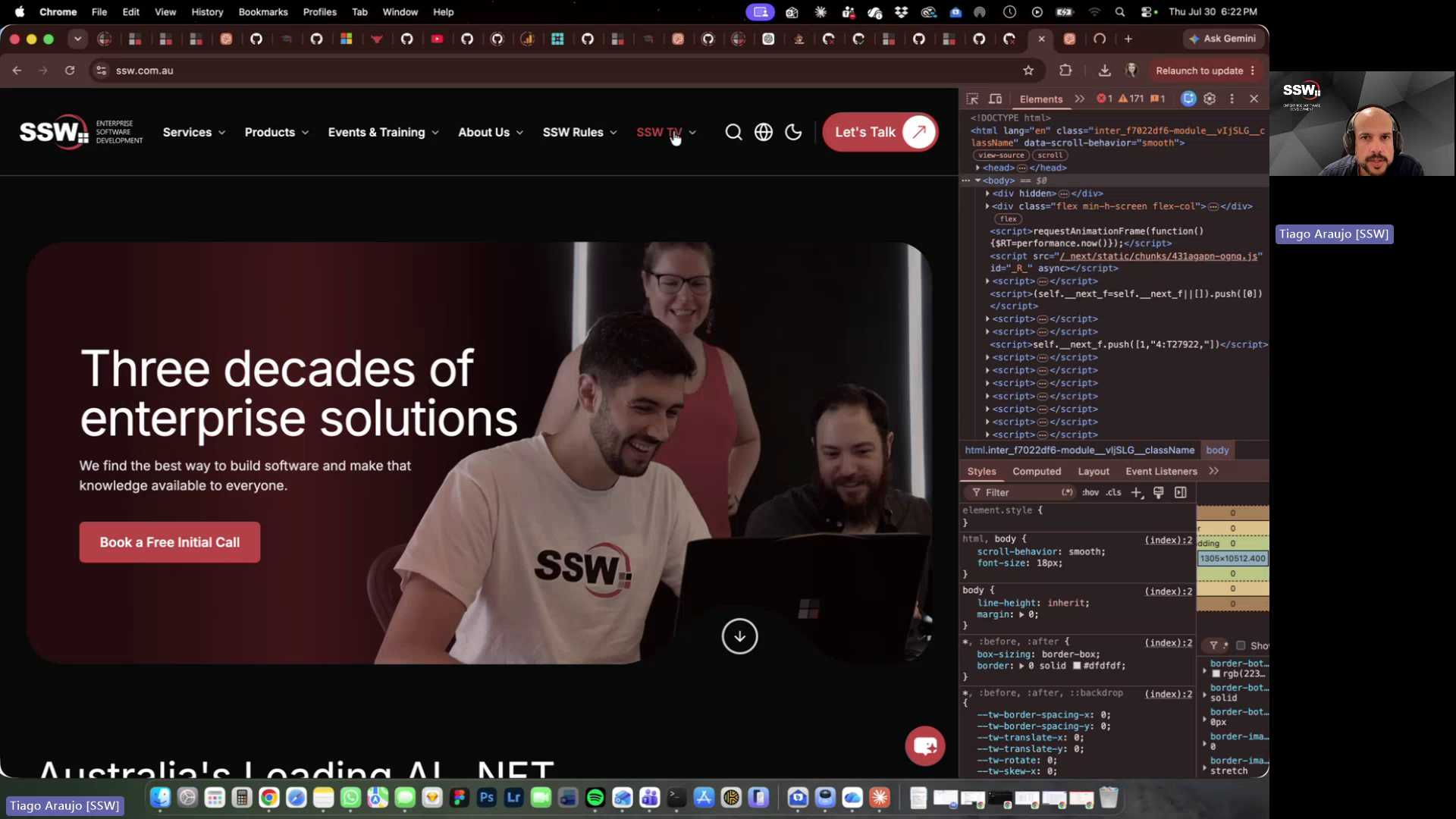
Figure: Main menu hover arrow color inconsistency
Contributor guide
No contributing guide indexed for this repository
First steps
- Read the whole issue, then the project's contributing guide.
- Comment on the issue to say you are picking it up — it saves two people doing the same work.
- Fork the repository and make your change on a branch.
- Open a pull request that references the issue number.
Research direction
Start with the SSW website homepage and inspect the main navigation, featured sections, product and latest video links, Rules page, and Playlists page described in the issue. Review the linked screen recording and reproduce the listed hover and spacing problems; the work is done when the acceptance criteria are applied consistently, icons and single-item playlists are appropriate, and contrast and affordance remain accessible.
Written by the indexing model from the issue text.
Assessment
- Tech stack
- nextjs
- Domain
- accessibility, design, frontend, web-dev
- Issue type
- Feature
- Difficulty
- 4/5
- Estimated time
- 3-5 days
- Activity status
- Quiet
- Clarity
- Mostly clear
- Newbie friendliness
- 55/100