SSWConsulting / SSWConsulting/SSW.Website
✨ Homepage conversion improvements - Buyer-first value prop, real CTA links, inline enquiry form, and engagement/industry IA
Nobody has claimed this yet.
- Dominant language
- HTML
- Stars
- 14
- Forks
- 10
- Avg merge
- 13h 51m
- Merged PRs (30d)
- 38
Description
Cc: @isaaclombardssw, @babakamyljanovssw @joshbermanssw @designbyalex
Hi @isaaclombardssw, @babakamyljanovssw
🟥 Watch the video (7 min 39 sec)
‼️ Original attached tasklist that was generated with the video ssw-website-review.tasks.md
Is your feature request related to a problem? Please describe.
SSW’s homepage appears optimised for the existing community (content marketing + events) rather than a high-intent buyer evaluating SSW to hire them.
Key conversion and IA problems observed in the review:
- Above-the-fold headline is SSW-centric (“three decades of enterprise solutions”) and doesn’t clearly state what SSW builds, for whom, and what outcomes the buyer gets.
- Primary CTA “Book a free initial call” exists as a
<button>without anhref(multiple instances). This reduces usability (no open in new tab), breaks SEO/link discoverability, and risks total loss of the conversion path if JS fails. - The strongest keyword/value line (“Australia’s leading AI, .NET and Azure consultants”) is below the fold and demoted.
- Nav IA has many dropdowns that lead away from hiring (services/products/events/about/rules/tv) and lacks buyer-first pathways such as industries, engagement model/pricing, and “how we engage”.
- Proof is mostly volume metrics (solutions delivered, happy clients, years) rather than buyer outcomes (time saved, ROI, guarantees).
- Case studies and logos exist but don’t foreground measurable results; case studies are far down the page.
- Conversion funnel is high friction: there are zero inline form fields on the homepage; contact is gated behind a multi-step modal wizard with required fields upfront.
- Testimonial carousel is potentially harmful for accessibility/performance due to duplicated text/word-by-word markup.
Describe the solution you'd like
Implement a set of homepage changes to improve buyer-first messaging and reduce lead-capture friction:
- Rewrite the hero headline/subhead to a buyer outcome/value proposition.
- Promote “Australia’s leading AI, .NET and Azure consultants” (or similar) above the fold.
- Ensure primary CTAs that navigate are real links (
<a href>), not JS-only buttons. - Add a short inline enquiry form on the homepage as a low-commitment conversion path.
- Update navigation to include buyer-first paths: Industries, How we engage, Engagement models (and optionally pricing guidance).
- Add measurable outcomes to proof areas:
- For logos: add 1 line of result/context and link to relevant story/case study.
- For case studies: lead with the result (impact) rather than backstory.
- Review the testimonial animation implementation for accessibility/performance (avoid duplicate/overly-fragmented text in DOM).
Describe alternatives you've considered
- Keep the current modal lead-capture flow but add an inline form as an additional (lower-friction) option.
- Keep buttons for styling but wrap with link semantics (or use Next.js
Link) so CTAs are crawlable and work without JS. - Add a dedicated “How we engage”/“Engagement models” landing page and link prominently from nav and homepage.
Additional context
Screenshot from competitor comparison showing strong buyer-first navigation and an inline enquiry form:
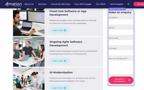
Figure: Competitor page with buyer-first navigation (Industries/How We Engage) and an inline “Make an enquiry” form.
Contributor guide
No contributing guide indexed for this repository
First steps
- Read the whole issue, then the project's contributing guide.
- Comment on the issue to say you are picking it up — it saves two people doing the same work.
- Fork the repository and make your change on a branch.
- Open a pull request that references the issue number.
Research direction
Start at the homepage implementation and trace the navigation, CTA, enquiry-form, proof, case-study, and testimonial entry points described in the issue. Review the current buyer journey and confirm which paths and content each area controls. Done means the requested buyer-first messaging, crawlable CTA links, inline enquiry path, navigation changes, outcome-focused proof, and accessible testimonial behavior are implemented and verified.
Written by the indexing model from the issue text.
Assessment
- Tech stack
- nextjs
- Domain
- content, frontend, web-dev
- Issue type
- Feature
- Difficulty
- 5/5
- Estimated time
- Over a week
- Activity status
- Quiet
- Clarity
- Mostly clear
- Newbie friendliness
- 30/100