SSWConsulting / SSWConsulting/SSW.Website
✨ Homepage CTA Hierarchy - Reduce excessive use of primary red buttons
Nobody has claimed this yet.
- Dominant language
- HTML
- Stars
- 14
- Forks
- 10
- Avg merge
- 13h 51m
- Merged PRs (30d)
- 38
Description
Requested by: @AntPolkanov via YakShaver.ai 🦬
cc: @AntPolkanov, @isaaclombardssw, @babakamyljanovssw, @micsblank
Hi Team!
🟥 Watch the video (2 min 29 sec)
Url from screen share: https://ssw.com.au
Pain
The ⭐ SSW Website (Dev - Next.js) homepage currently uses the primary red CTA styling too frequently across multiple sections. This reduces the visual hierarchy and weakens the emphasis of the main conversion action, which is booking a free initial call.
Update the homepage button styles so that only primary conversion actions use the filled red CTA style. Secondary actions such as "View All Services", "More Client Stories", "SSW People", and "More Events" should use a secondary outlined button style instead (black background with red border).
The "Book a Free Initial Call" CTA should remain as the primary filled red button throughout the homepage. The "Register Now" event CTA requires design review before changing, as the reporter was uncertain whether it should remain primary.
Acceptance Criteria
- Primary filled red CTA styling is reserved for key conversion actions on the homepage
- "Book a Free Initial Call" buttons remain styled as primary filled red CTAs
- "View All Services" uses the secondary outlined button style
- "More Client Stories" uses the secondary outlined button style
- "SSW People" section CTA uses the secondary outlined button style if it is not considered a primary conversion action
- "More Events" uses the secondary outlined button style
- Secondary outlined buttons use a black background with a red border consistent with the site design system
- A design decision is made and documented for whether "Register Now" should remain a primary red CTA or become secondary
- Homepage CTA hierarchy provides clearer visual emphasis on the main conversion action
Screenshot
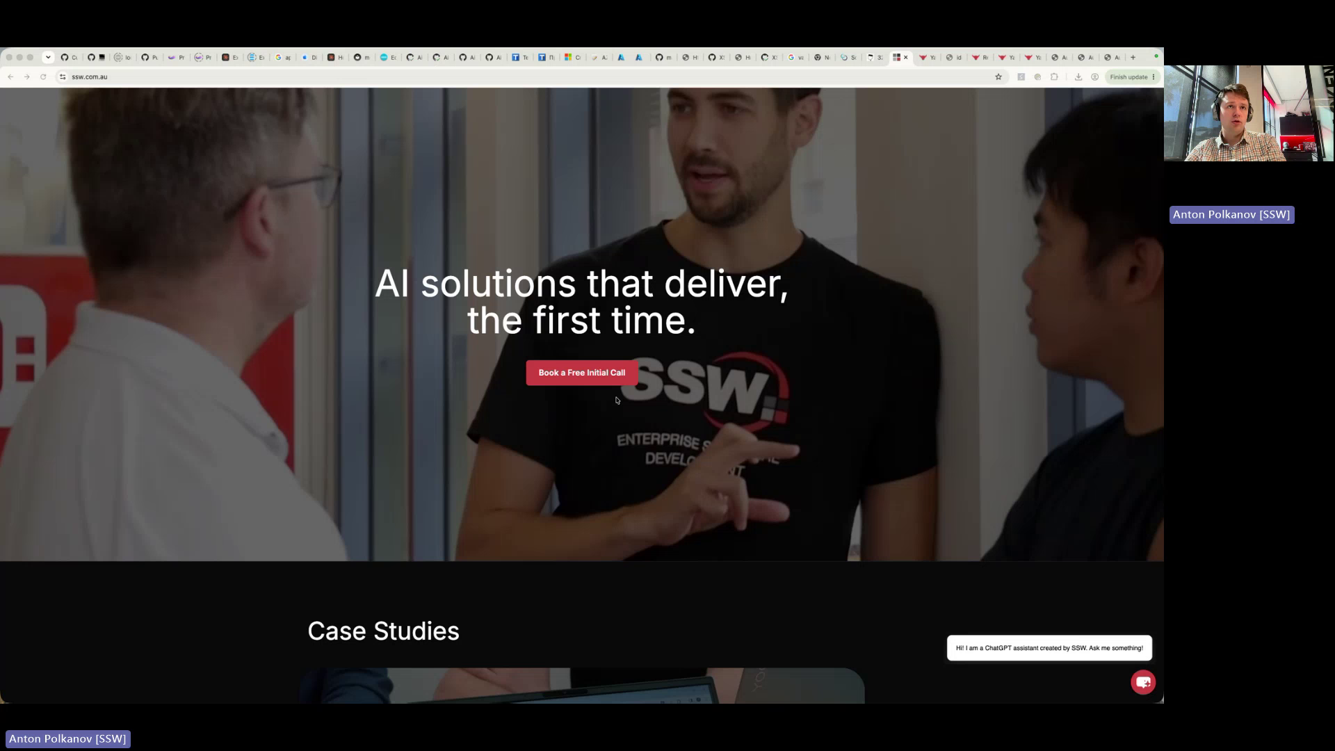
Figure: Homepage overuses red primary CTA buttons
Contributor guide
No contributing guide indexed for this repository
First steps
- Read the whole issue, then the project's contributing guide.
- Comment on the issue to say you are picking it up — it saves two people doing the same work.
- Fork the repository and make your change on a branch.
- Open a pull request that references the issue number.
Research direction
Start at the SSW Website (Dev - Next.js) homepage and inspect the CTA sections named in the issue: View All Services, More Client Stories, SSW People, More Events, Book a Free Initial Call, and Register Now. Compare their current styles with the described secondary outlined treatment, confirm the Register Now design decision, and verify that primary conversion actions remain filled red while the listed secondary actions use black backgrounds with red borders.
Written by the indexing model from the issue text.
Assessment
- Tech stack
- nextjs
- Domain
- design, frontend, web-dev
- Issue type
- Feature
- Difficulty
- 3/5
- Estimated time
- 1-2 days
- Activity status
- Quiet
- Clarity
- Mostly clear
- Newbie friendliness
- 62/100