SSWConsulting / SSWConsulting/SSW.Rules
UI - Improve Mobile Responsiveness of Rules
Nobody has claimed this yet.
- Dominant language
- TypeScript
- Stars
- 26
- Forks
- 17
- Avg merge
- 14h 39m
- Merged PRs (30d)
- 2
Description
Hi @taineriley1
As per our conversation, some parts of Rules aren't very responsive. The below are my suggestions for improving the mobile view of Rules:
-
Shrink the Rules logo and user avatar / login button, aligning them at the top of the header as shown below
-
Lower the size of the breadcrumb's text and lighten the text colour to enforce a visual hierarchy
(Note: i've added a suggestion for shortening the breadcrumb here: https://github.com/SSWConsulting/SSW.Rules/issues/392) -
Lower the font size of Rules titles for mobile
-
Lower the font size and lighten the colour of the "Last edited by" line
(I'd also suggest trying to shorten this text, example shown below) -
Keep the buttons arranged horizontally, below the title, and center everything as shown below
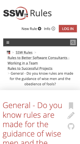
Figure: Bad example - header, breadcrumb, and title are killing all the space.
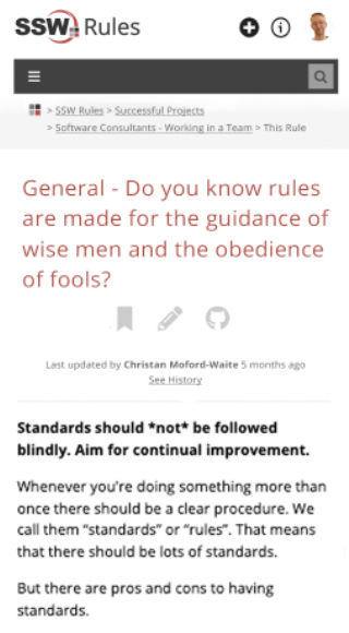
Figure: Good example - Resized + positioned elements use space more efficiently
- When viewing a category - reduce the margin / padding of text in the rules to match the category description's spacing (shown below)
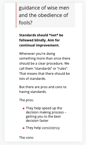
Figure: Bad example - Too much white space on sides of rule text (on category pages)
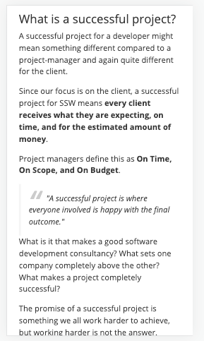
Figure: Good example - Category description text / padding / ideal 30-40 characters per line
(The padding isn't an issue on the individual rule's pages either)
Contributor guide
No contributing guide indexed for this repository
First steps
- Read the whole issue, then the project's contributing guide.
- Comment on the issue to say you are picking it up — it saves two people doing the same work.
- Fork the repository and make your change on a branch.
- Open a pull request that references the issue number.
Research direction
Start by locating the Rules header, breadcrumb, title, metadata, buttons, and category-page rule content, then compare their mobile layouts with the supplied screenshots. Implement the listed responsive sizing, alignment, colour, spacing, and padding changes, and verify both category and individual rule pages at mobile widths.
Written by the indexing model from the issue text.
Assessment
- Tech stack
- nextjs, typescript
- Domain
- design, frontend, web-dev
- Issue type
- Feature
- Difficulty
- 4/5
- Estimated time
- 3-5 days
- Activity status
- Stale
- Clarity
- Mostly clear
- Newbie friendliness
- 35/100