SSWConsulting / SSWConsulting/SSW.Rules
UI - Improve Filter Buttons
Open
Nobody has claimed this yet.
- Dominant language
- TypeScript
- Stars
- 26
- Forks
- 17
- Avg merge
- 14h 39m
- Merged PRs (30d)
- 2
Description
As per my conversation with @bradystroud,
- Improve the filter buttons on both the profile page and the rule category pages
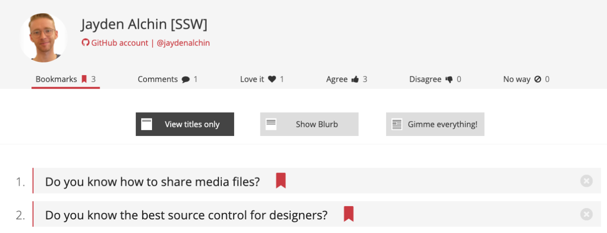
Figure: Bad Example - These chunky buttons feel out of place
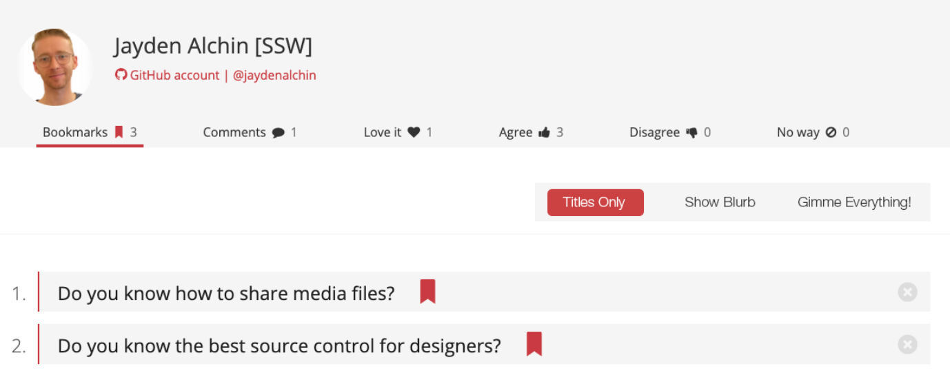
Figure: Good Example - Modernised slider, quick and dirty
Contributor guide
No contributing guide indexed for this repository
First steps
- Read the whole issue, then the project's contributing guide.
- Comment on the issue to say you are picking it up — it saves two people doing the same work.
- Fork the repository and make your change on a branch.
- Open a pull request that references the issue number.
Research direction
Start by locating the filter buttons on the profile page and rule category pages, then compare their current appearance with the attached bad and good examples. Update both areas to use the more modern, less chunky filter-button style, and confirm the controls look consistent on each page.
Written by the indexing model from the issue text.
Assessment
- Tech stack
- nextjs, typescript
- Domain
- design, frontend
- Issue type
- Feature
- Difficulty
- 3/5
- Estimated time
- 1-2 days
- Activity status
- Stale
- Clarity
- Mostly clear
- Newbie friendliness
- 35/100