RocketChat / RocketChat/Rocket.Chat
Non-intuitive user context menu
Nobody has claimed this yet.
- Dominant language
- TypeScript
- Stars
- 46.1k
- Forks
- 13.9k
- Avg merge
- 3d 3h
- Merged PRs (30d)
- 130
Description
E.g. to remove a user from a room one will have to open the list of users in the room (so far no problems) but then the next step is to open the context menu for the user we want to remove. This can be done with a click on the three dots beside the users name but the context menu that pops up has a very bad indication of being scrollable.
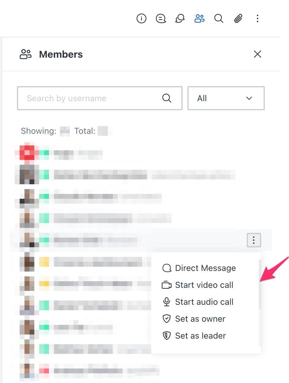
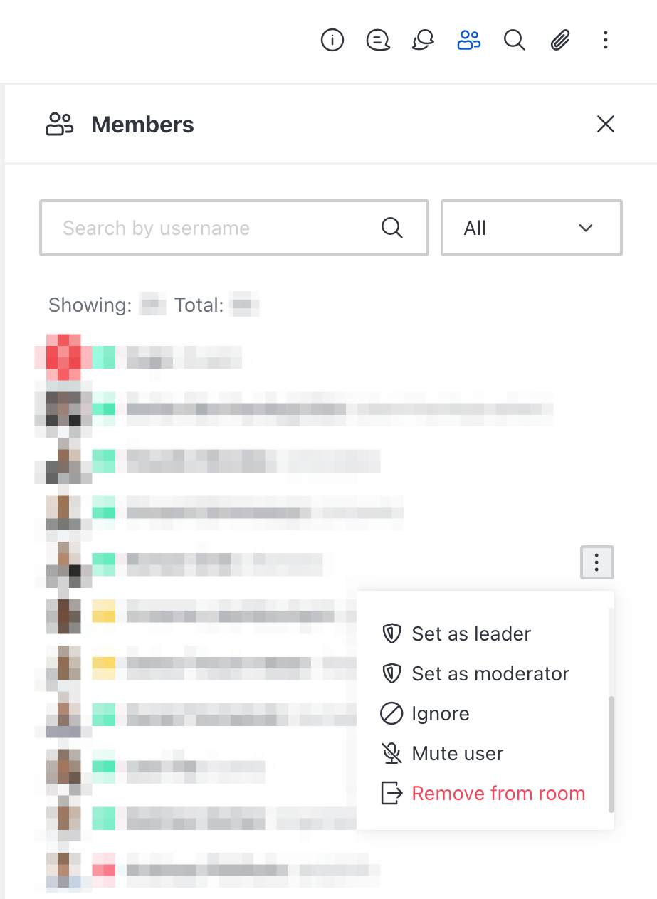
It seem that this really isn't intuitive: In our company of ~60 people we had people asking how to remove users from a room twice in the last week alone and e.g. https://github.com/RocketChat/Rocket.Chat/issues/21811#issuecomment-827124541 and https://github.com/RocketChat/Rocket.Chat/issues/21811#issuecomment-1004030862 show that this seems to be a general issue among the Rocket.Chat user-base (they we're talking about the same context menu when looking at a single user but I guess it's the exact same UI element).
As a simple fix I would recommend to avoid scrolling in this context menu completely.
Contributor guide
First steps
- Read the whole issue, then the project's contributing guide.
- Comment on the issue to say you are picking it up — it saves two people doing the same work.
- Fork the repository and make your change on a branch.
- Open a pull request that references the issue number.
Research direction
Start by reproducing the user-list flow and inspecting the context menu opened from the three-dot control beside a room member. Compare the two screenshots and the related issue comments, then determine whether removing scrolling is feasible. Done means the menu’s available actions are intuitive without requiring users to discover hidden scrolling.
Written by the indexing model from the issue text.
Assessment
- Tech stack
- typescript
- Domain
- design, frontend
- Issue type
- Bug
- Difficulty
- 3/5
- Estimated time
- 1-2 days
- Activity status
- Stale
- Clarity
- Mostly clear
- Newbie friendliness
- 42/100