[Mobile] Responsive pass — all pages at 375px width
Nobody has claimed this yet.
Assessment
- Difficulty
- 4/5
- Estimated time
- 3-5 days
- Newbie friendliness
- 48/100
- Issue type
- Feature
- Clarity
- Mostly clear
- Activity status
- Quiet
- Tech stack
- css
- Domain
- accessibility, design, frontend, testing
Research direction
Start with the current responsive CSS and the approved Sage & Blush mobile mockup, then use Chrome DevTools at 375×667 to audit dashboard, accounts, ledgers, review, and settings. Check the listed mobile-nav, button, grid, padding, contrast, and landscape requirements. Done means all acceptance criteria pass without horizontal overflow and with accessible tap targets, contrast, and safe-area spacing.
Written by the indexing model from the issue text.
Description
Part of Epic #340 — Sage & Blush UI Redesign
Depends on: #343 (nav), #344 (dashboard), #345 (accounts), #346 (ledgers), #347 (review)
Layer 5 — Final QA / mobile polish pass. Done after all page tickets land.
Overview
A systematic mobile audit across all redesigned pages at 375px viewport width (iPhone SE / standard phone size). Ensure the Sage & Blush design holds up on small screens.
Approved Mobile Mockup
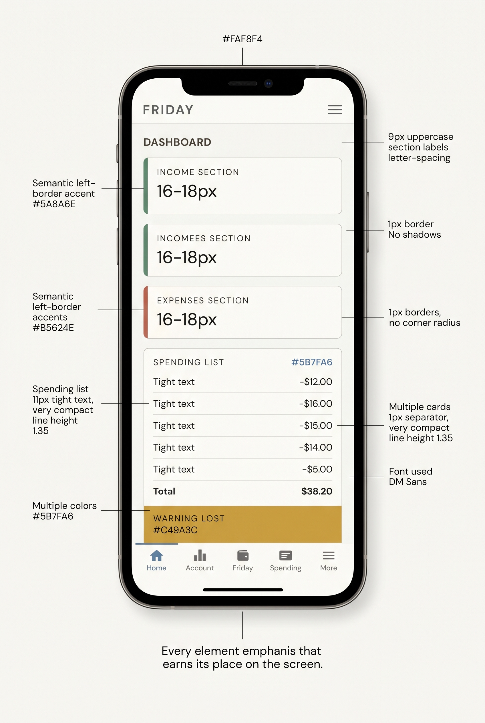
Checklist by Page
All Pages
- No horizontal scroll at 375px (check with browser DevTools)
- All interactive elements: min 44px tap target height
- Bottom mobile nav: correct Lucide icons, 44px tap targets, cobalt active
- Header: 44px height, wordmark visible, theme toggle accessible
- Body text (11px) remains readable — check contrast (WCAG AA 4.5:1 minimum)
Dashboard
- Stat tiles: 2-column grid still works at 375px (or falls back to 1-column)
- Spending bar chart: bars don't overflow container
- Sync log: scrollable but doesn't overflow viewport
- Sync button: full-width at 375px (
.action-rowstacking)
Accounts
- Net worth card: numbers legible (clamp font-size working)
- Institution headers: not clipped
- Account cards (accordion): full width, touch-friendly expand
- Account balance: still 16px, right-aligned
- Action buttons (disconnect, rename): stacked or full-width
Ledgers
- Period selector: wraps gracefully (no overflow)
- Custom date range row: inputs don't clip
- Summary cards: full-width, amounts readable
- Drill-down table: scrollable horizontally if wide, or columns hidden via
.responsive-hide-sm - Totals row: stacks vertically at 375px (already in responsive CSS — verify)
Review
- Review cards: full-width, status chips visible
- Amounts: not clipped
- Action buttons: full-width stacked
- Reasoning text: wraps correctly (no overflow)
Changes Required
Mobile nav icon sizing
Ensure Lucide icons in mobile nav render at the right size:
.mobile-nav .mobile-nav-icon svg {
  width: 22px;
  height: 22px;
  stroke-width: 2px;
}
Button tap targets
All .btn-sm instances in tables/toolbars need 44px min-height on mobile:
@media (max-width: 480px) {
  .btn-sm { min-height: var(--tap); padding: 10px 14px; }
}
(This already exists in current CSS — verify it still applies after component changes.)
Dashboard grid on mobile
@media (max-width: 480px) {
  .dashboard-grid {
    grid-template-columns: 1fr;  /* single column on phones */
    gap: var(--space-2);
  }
}
Bottom nav padding
Ensure body padding-bottom accounts for the 44px nav + safe area:
@media (max-width: 480px) {
  body { padding-bottom: max(80px, calc(44px + env(safe-area-inset-bottom) + 16px)); }
}
Testing Protocol
- Open Chrome DevTools → Device Toolbar → iPhone SE (375×667)
- Test each page: dashboard, accounts, ledgers, review, settings
- Rotate to landscape (667×375) — ensure no layout breaks
- Test with iOS Safari user agent for safe-area-inset-bottom
- Check contrast:
--mutedtext on--bg(warm off-white bg changes contrast from pure white)
Contrast check for 9px labels
At 9px, WCAG Large Text threshold doesn't apply. Aim for 7:1 contrast on small text. Verify:
--muted(#8A7F78) on--bg(#FAF8F4) → check contrast ratio- Adjust
--mutedif below 4.5:1
Acceptance Criteria
- No page has horizontal scroll at 375px
- All tap targets ≥ 44px on mobile
- Mobile nav renders with Lucide SVG icons (not emoji)
- Dashboard grid: 1-column at 375px
- Stat tile numbers readable at 375px (not clipped)
- Contrast: body text and labels meet WCAG AA (4.5:1+)
- Safe area inset respected on bottom nav (iPhone X+ notch)
- Landscape rotation at 375 height: no broken layouts
- Dominant language
- Python
- Stars
- 1
- Forks
- 1
- PR merge metrics
- No merged PRs in 30d
Contributor guide
First steps
- Read the whole issue, then the project's contributing guide.
- Comment on the issue to say you are picking it up — it saves two people doing the same work.
- Fork the repository and make your change on a branch.
- Open a pull request that references the issue number.
More from Riddy21/Friday_Budgeting_Pro
-
Contact Hong Opentask
Difficulty 5/5 Over a week Newbie friendliness 1/100
Riddy21/Friday_Budgeting_Pro#353 ·
-
enhancement frontend ui
Difficulty 3/5 1-2 days Newbie friendliness 65/100
Riddy21/Friday_Budgeting_Pro#347 ·
-
enhancement frontend ui
Difficulty 4/5 3-5 days Newbie friendliness 52/100
Riddy21/Friday_Budgeting_Pro#346 ·
-
enhancement frontend ui
Difficulty 3/5 1-2 days Newbie friendliness 52/100
Riddy21/Friday_Budgeting_Pro#345 ·
-
enhancement frontend ui ux
Difficulty 4/5 3-5 days Newbie friendliness 55/100
Riddy21/Friday_Budgeting_Pro#344 ·
All issues in Riddy21/Friday_Budgeting_Pro
Similar issues
-
Difficulty 2/5 1-3 hours Newbie friendliness 74/100
bancolombia/sentinel#23 ·
-
test md OpenCI
Difficulty 2/5 1-3 hours Newbie friendliness 74/100
-
integration:quickjs org:external priority:backlog topic:code-interpreter topic:middleware type:feature
Difficulty 2/5 1-3 hours Newbie friendliness 74/100
langchain-ai/deepagents#6450 ·
-
bug client
Difficulty 2/5 1-3 hours Newbie friendliness 88/100
-
Difficulty 2/5 1-3 hours Newbie friendliness 74/100