LAION-AI / LAION-AI/Open-Assistant
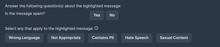
No way to distinguish between a toggle and a chip
Nobody has claimed this yet.
- Dominant language
- Python
- Stars
- 37.4k
- Forks
- 3.3k
- PR merge metrics
- No merged PRs in 30d
Description
Chips that allow you to selected multiple options and toggles that only allow a single answer should have a way to distinguish between them to make it more clear. Currently the Yes/No buttons look the same as the Wrong Language/Not Appropriate/Contains PII/Hate Speech/Sexual Content. This makes the UX look less intuitive and also confusion at first glance about how many options you can select for "Select any that apply to the highlighted message:"
Contributor guide
First steps
- Read the whole issue, then the project's contributing guide.
- Comment on the issue to say you are picking it up — it saves two people doing the same work.
- Fork the repository and make your change on a branch.
- Open a pull request that references the issue number.
Research direction
The issue does not name a file, test, or entry point; start by locating the interface shown in the screenshot and the code that renders its Yes/No and multi-select options. Done means the two interaction types are visually distinguishable while retaining their single-choice and multi-choice behavior.
Written by the indexing model from the issue text.
Assessment
- Tech stack
- nextjs
- Domain
- design, frontend
- Issue type
- Feature
- Difficulty
- 3/5
- Estimated time
- 1-2 days
- Activity status
- Stale
- Clarity
- Mostly clear
- Newbie friendliness
- 35/100