solid_gauge series formatting inconsistencies
- Dominant language
- Python
- Stars
- 2.8k
- Forks
- 419
- PR merge metrics
- No merged PRs in 30d
Description
The formatting for series on the solid_gauge graph is neither consistent nor understandable.
For example:
```
gauge_chart = pygal.SolidGauge(
height=175,
half_pie=True,
inner_radius=.5,)
gauge_chart.add('Tank 1', [{'value': 22, 'max_value': 25}])
gauge_chart.add('Tank 2', [{'value': 20, 'max_value': 25}])
gauge_chart = gauge_chart.render_data_uri()
```
Results in two charts in a column, one over the other. This continues with a third series adding another row.
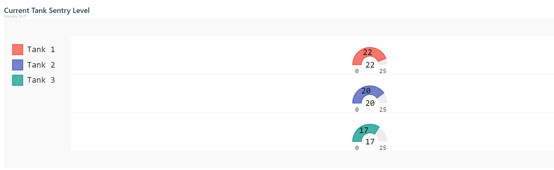
But this changes with four series.
```
gauge_chart = pygal.SolidGauge(
height=175,
half_pie=True,
inner_radius=.5,)
gauge_chart.add('Tank 1', [{'value': 22, 'max_value': 25}])
gauge_chart.add('Tank 2', [{'value': 20, 'max_value': 25}])
gauge_chart.add('Tank 3', [{'value': 17, 'max_value': 25}])
gauge_chart.add('Tank 4', [{'value': 15, 'max_value': 25}])
gauge_chart = gauge_chart.render_data_uri()
```
Now it is two rows of two series each.
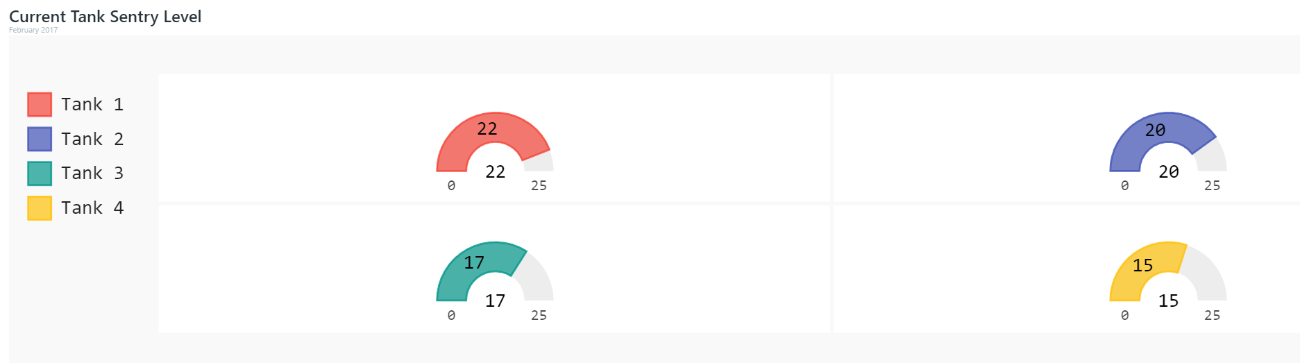
Five series results in the format switching again, now to two rows of two and one row of one series and one blank.
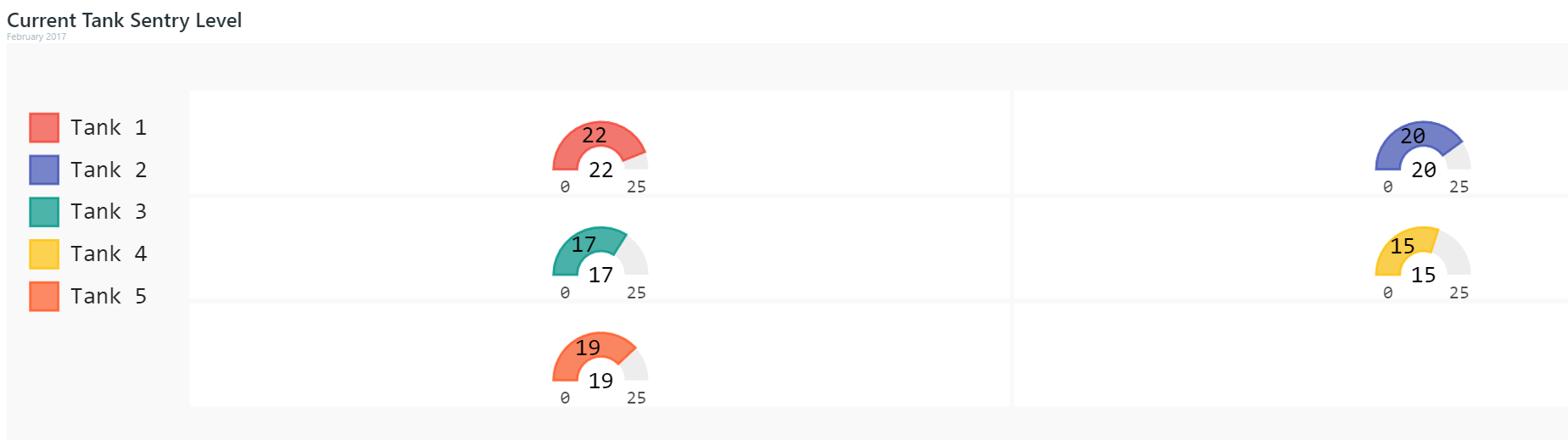
Six is where it just stops making sense.
```
gauge_chart = pygal.SolidGauge(
height=175,
half_pie=True,
inner_radius=.5,)
gauge_chart.add('Tank 1', [{'value': 22, 'max_value': 25}])
gauge_chart.add('Tank 2', [{'value': 20, 'max_value': 25}])
gauge_chart.add('Tank 3', [{'value': 17, 'max_value': 25}])
gauge_chart.add('Tank 4', [{'value': 15, 'max_value': 25}])
gauge_chart.add('Tank 5', [{'value': 19, 'max_value': 25}])
gauge_chart.add('Tank 6', [{'value': 12, 'max_value': 25}])
gauge_chart = gauge_chart.render_data_uri()
```
Now we get two rows of three series each, **and then a third row of three blanks**?
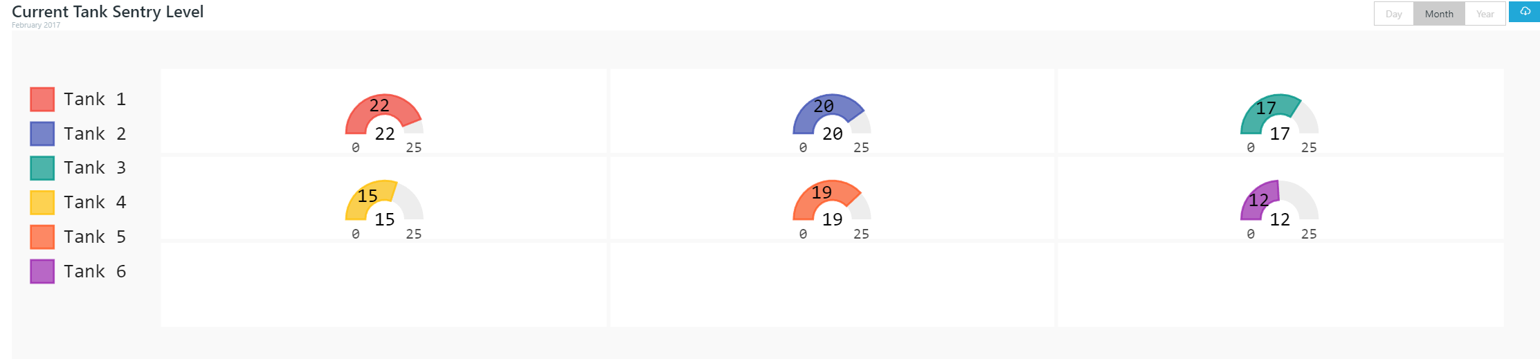
It crashes with eight series, giving a `ZeroDivisionError at /` in django. And don't get me started on ten series! This creates two rows of four series each, one row of two series and two blanks, and one row of four blanks.
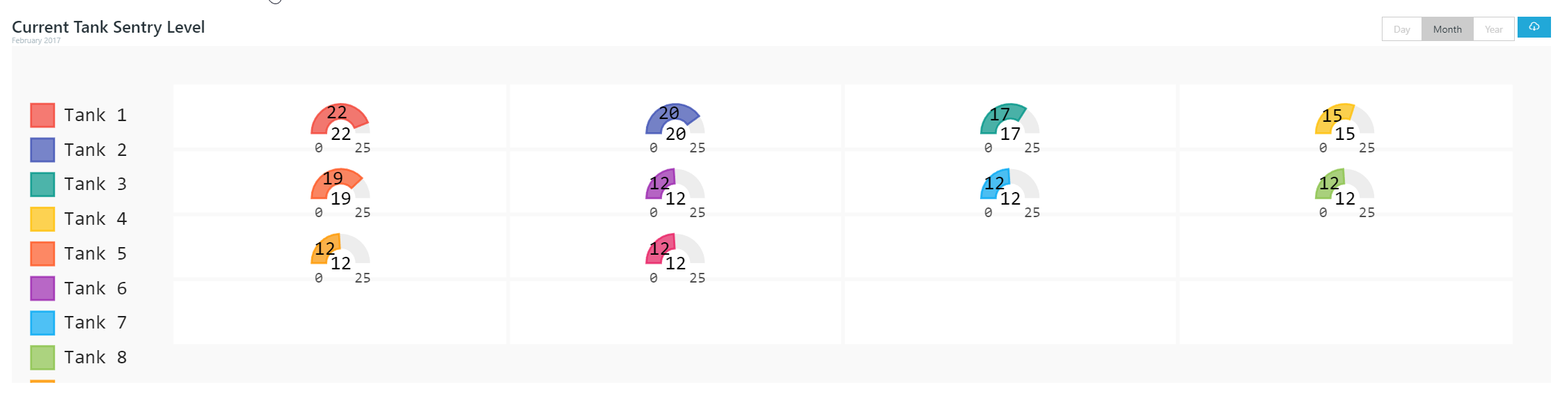
I looked over the source code for solid_gauge and I can't really understand what is going on with the grid for series. It isn't creating a square, but there is some pattern here. What am I missing?
Contributor guide
Research direction
Start in the solid_gauge source and trace how series are laid out when render_data_uri() is called. Reproduce the examples with varying numbers of series, including the eight-series ZeroDivisionError, and inspect the grid calculation. Done means the layout behaves consistently for these cases without blank cells or a crash.
Written by the indexing model from the issue text.
Assessment
- Tech stack
- python
- Domain
- data-visualization
- Issue type
- Bug
- Difficulty
- 4/5
- Estimated time
- 3-5 days
- Activity status
- Stale
- Clarity
- Mostly clear
- Newbie friendliness
- 35/100