GothenburgBitFactory / GothenburgBitFactory/timewarrior
Chart report extension
- Dominant language
- C++
- Stars
- 1.7k
- Forks
- 117
- Avg merge
- 1d 7h
- Merged PRs (30d)
- 5
Description
Hi everyone,
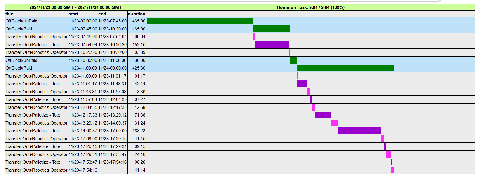
I'm wondering if visually representing the data in day/week/month report in more than one horizontal line, one per record. with the description on one side would make TimeWarrior more useful in presenting the data.
What I find is if I have recorded multiple activities in a small chucks, because the graph represents the data in the same line for a 24 hour period, I'm not able to read the description.
I will attach some images that shows the type of graph that I'm describing.
Thank you :)

Contributor guide
Assessment
This issue has not been assessed yet.