FreeTubeApp / FreeTubeApp/FreeTube
Improving pop-up styling
- Dominant language
- Vue
- Stars
- 21.9k
- Forks
- 1.5k
- Avg merge
- 1d 15h
- Merged PRs (30d)
- 62
Description
**Is your feature request related to a usage problem (not a bug)? Please describe.**
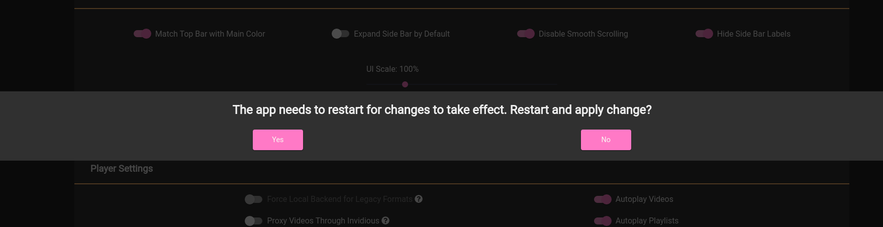
The popup styling used for various alerts and functions across the app is strange and looks tacky. The popups span the entire screen in a thin section and the buttons are spread far apart.
**Describe the solution you'd like to see implemented**
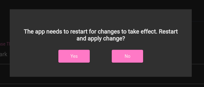
To make it less of a thin line and a more neat and compact popup.
**Describe alternatives you've considered**
None.
**Screenshots**
Before changes:
Example after changes:
**Additional context**
I made the max-width of the popup 500px.
I made the flex box for the buttons 400px.
I also made the h3 -> h2.
In addition I added 40px padding to the main popup element.
I would make a PR but the way I made this test was solely for demonstration (not dynamic).
Contributor guide
Assessment
This issue has not been assessed yet.