Fernthedev / Fernthedev/quest-rue
UX: Object Viewer is too cluttered/noisy
- Dominant language
- TypeScript
- Stars
- 8
- Forks
- 2
- PR merge metrics
- No merged PRs in 30d
Description
Currently, the ObjectViewer panel as it is currently is not very friendly in terms of readability. As it stands, there is too much visual noise and inconsistency making it difficult to parse the data.
While the underlying idea behind the UI components is useful and acceptable, it needs to be reworked to be easier on the eyes in large amounts (the current UI concept can be kept as a compact mode, as it may be preferable to some)
In other words, it is serviceable but less than ideal.
Screenshot of the UI in the current state:
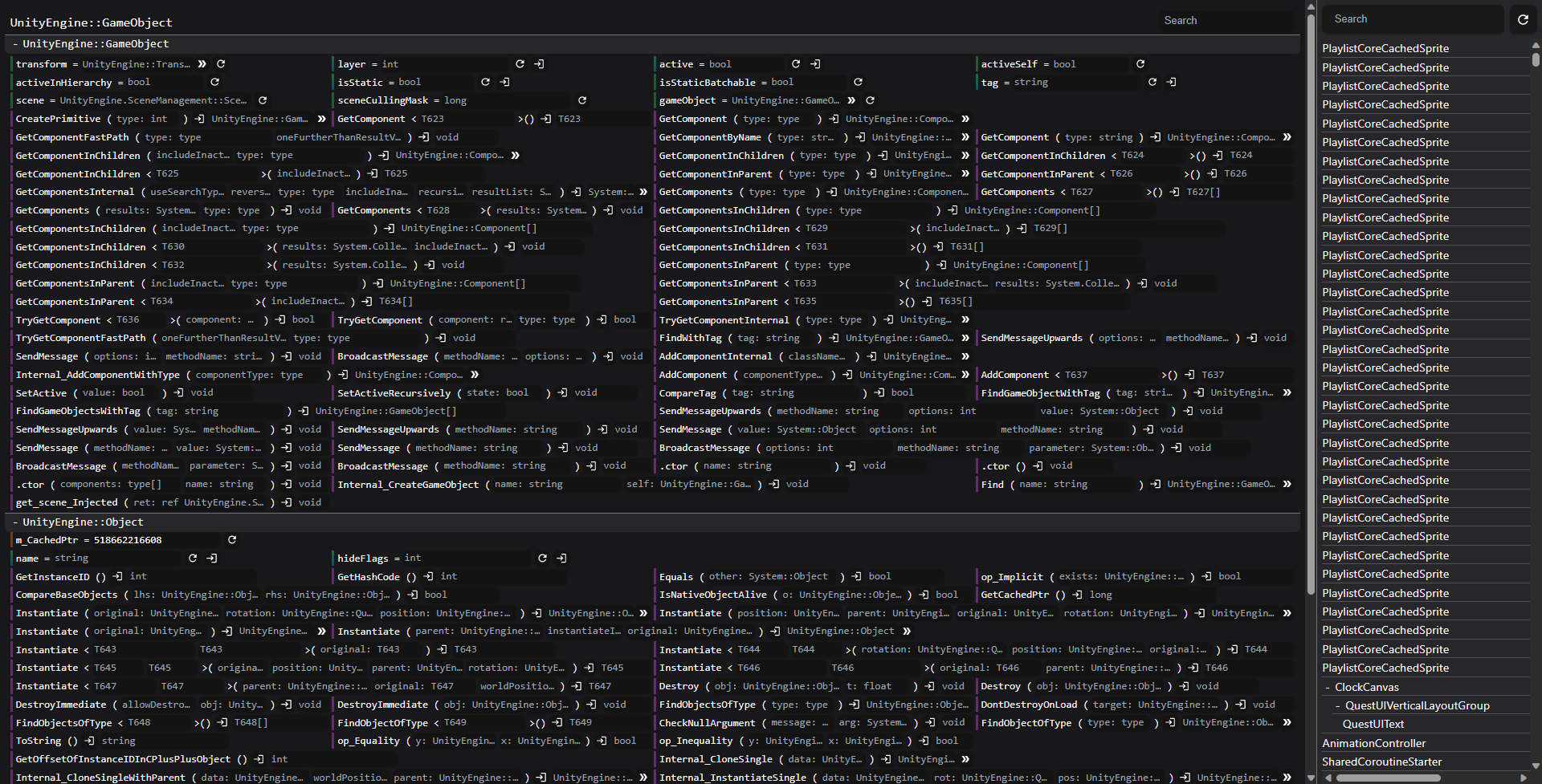
Some ideas for improving the UI:
- Grouping overloads into collapse buttons
- Separating fields/properties/methods into collapsed groups
- Increasing size and reducing density
This issue aims to track the problem at hand and provide a place to discuss ideas or solutions.
Contributor guide
No contributing guide indexed for this repository
Assessment
This issue has not been assessed yet.