enhance clarity of play tab
- Dominant language
- Python
- Stars
- 78
- Forks
- 89
- PR merge metrics
- No merged PRs in 30d
Description
Hello guys, i don't know what future plans exist for the client and its not really necessary, but the nice new "Single-Line Mod-Vault toolbar" made me think about enhancing the "Play" tab.
Currently the style is not consistent, plus especially new Fafies got no idea what the current ladder map rotation is, except they know where to look.
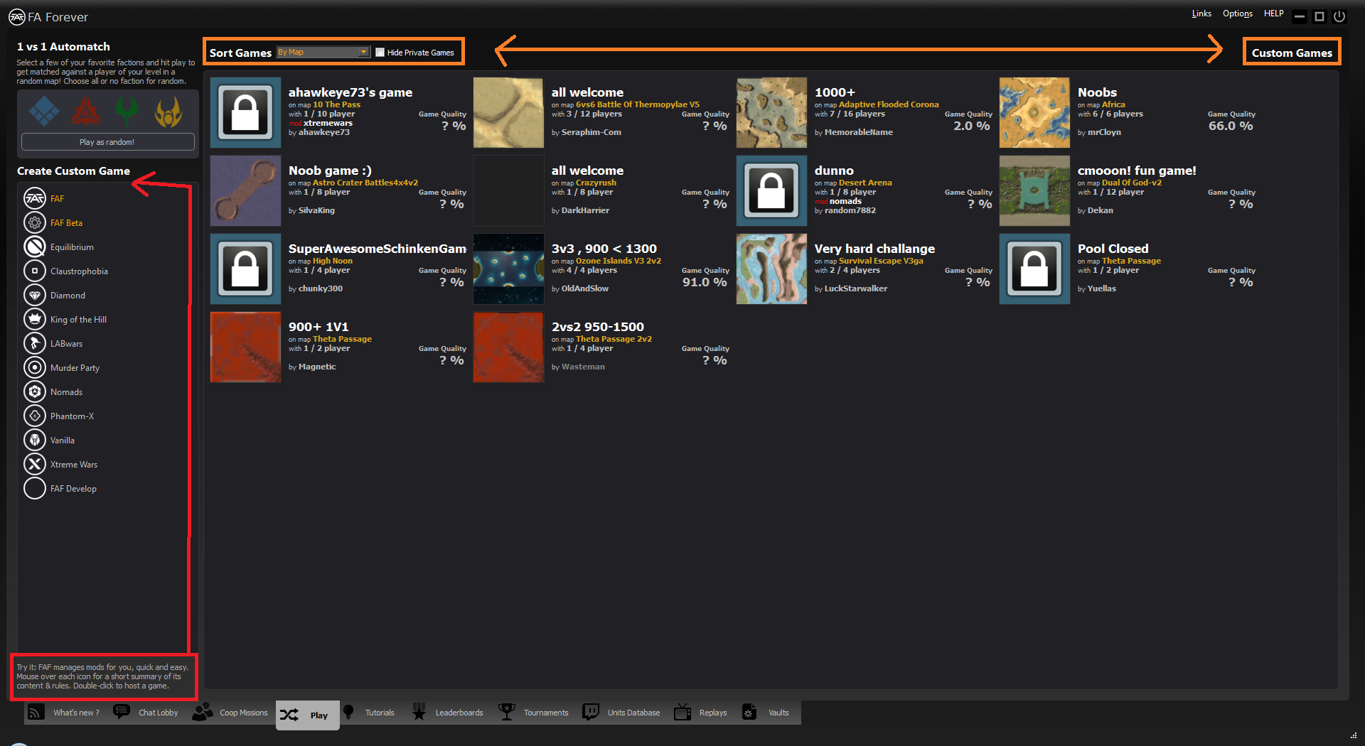
So here are my suggestions:
v1) Move some titles, descriptions and sorting (closer to options) + add link to ladder rotation
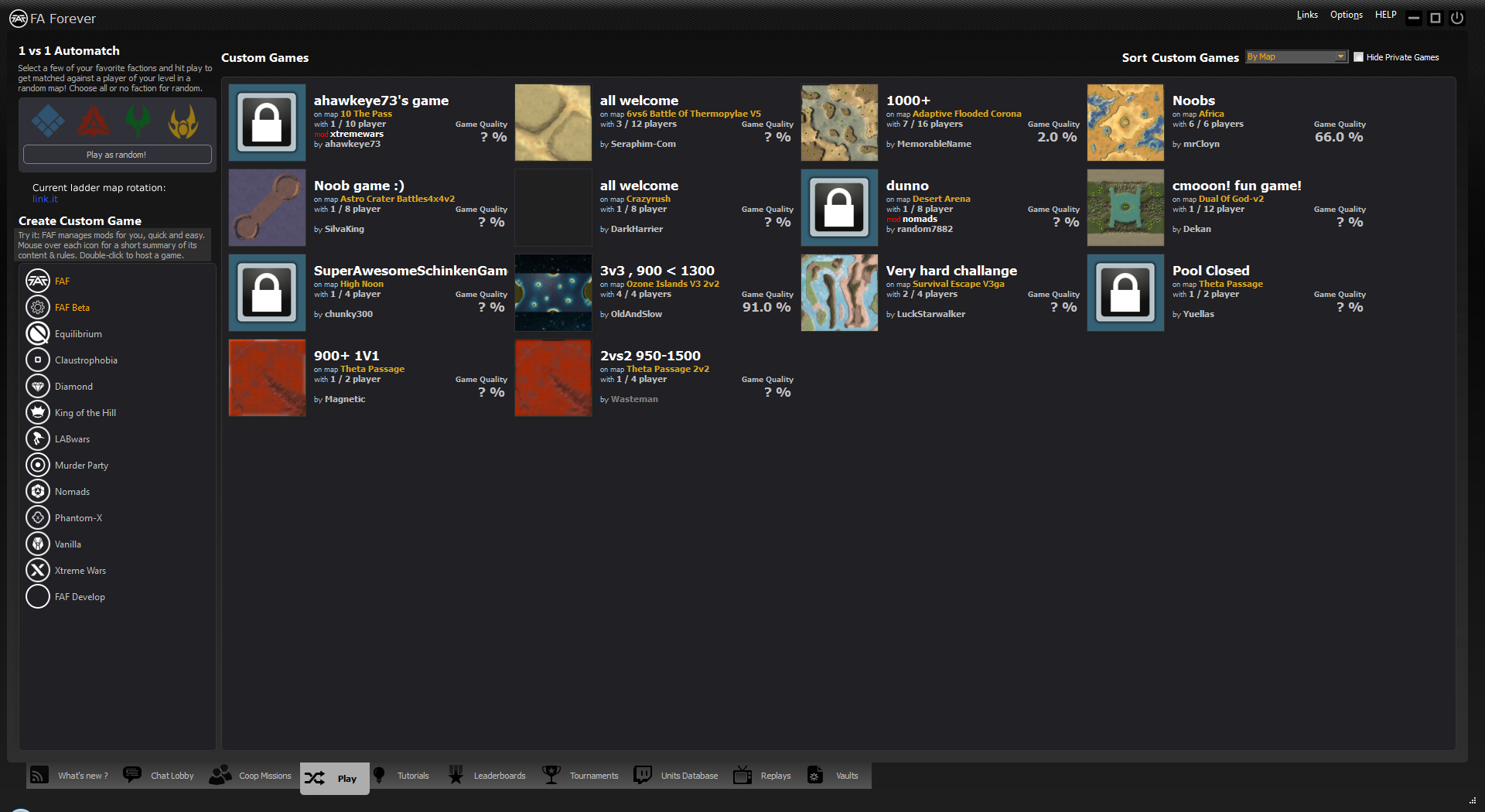
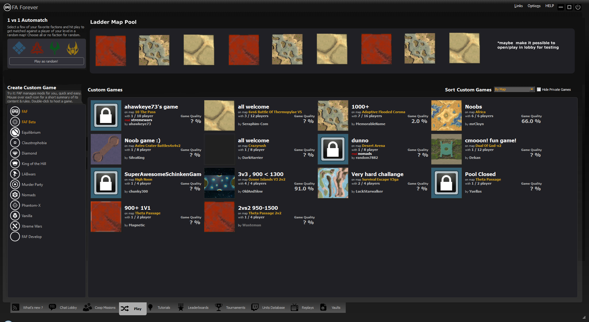
v2) Similar to v1, but shows the current ladder map pool (and maybe make it possible to host maps for testing in the lobby)
I hope you like the idea, since I'm unable to do myself. Maybe somebody of you finds it worth implementing or got somehow inspired.
regards
Contributor guide
No contributing guide indexed for this repository
Assessment
This issue has not been assessed yet.