Dimillian / Dimillian/IceCubesApp
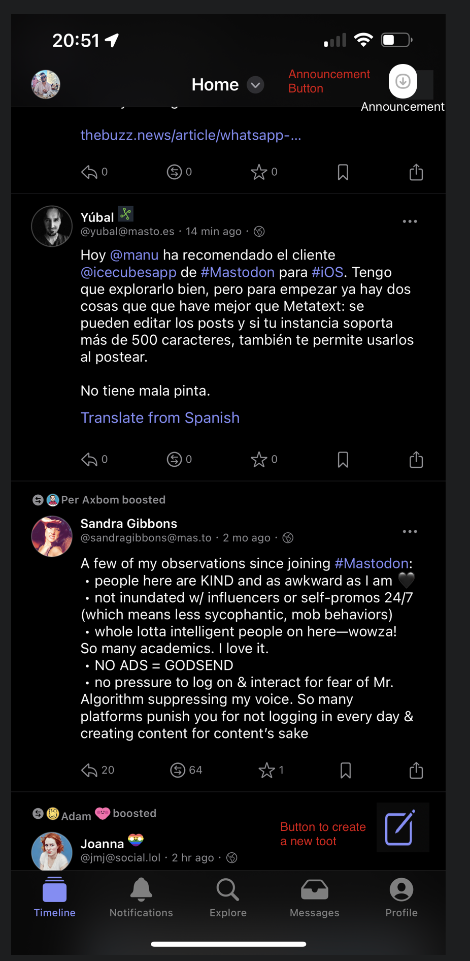
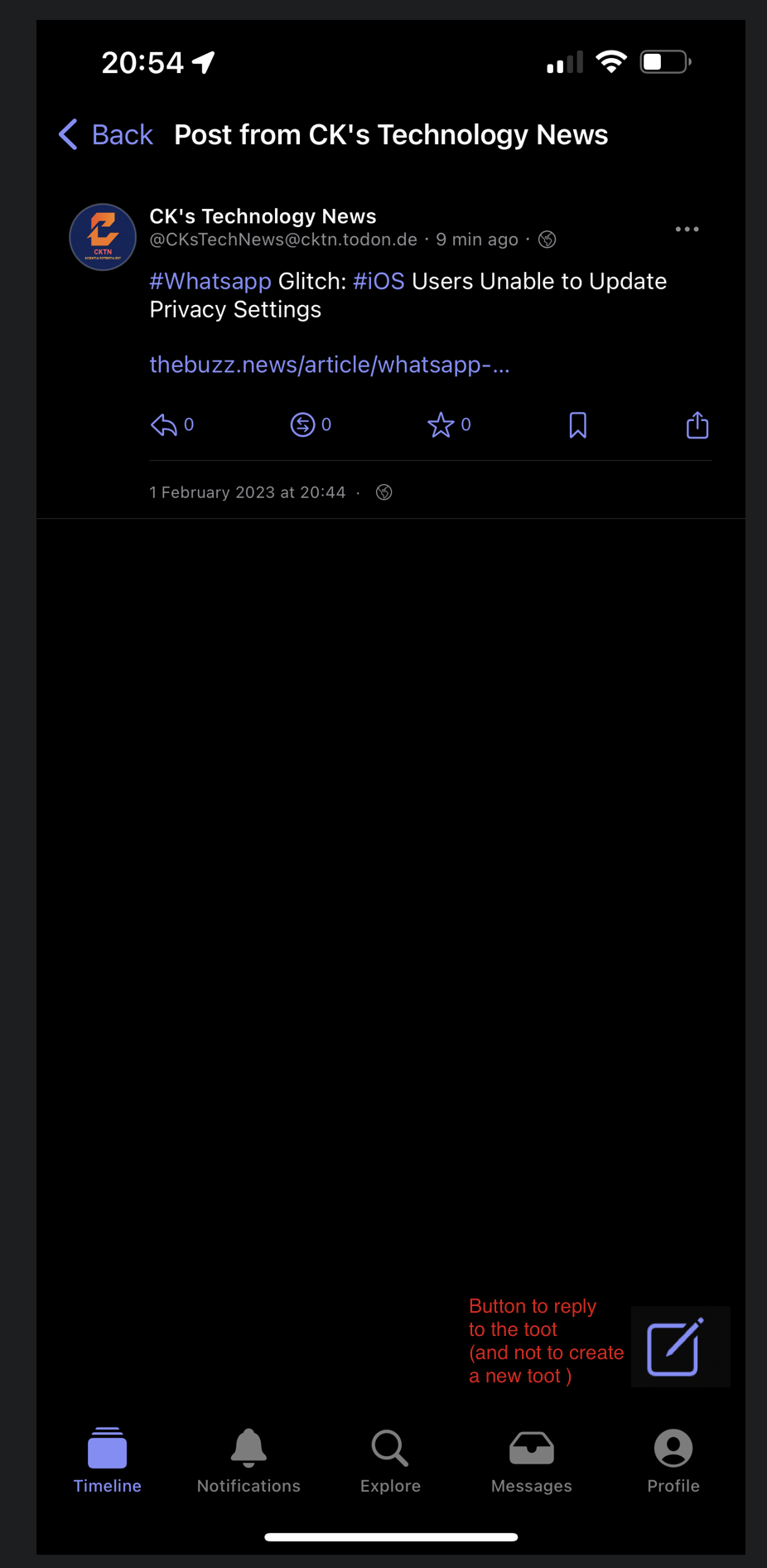
Better Home page UI
Nobody has claimed this yet.
- Dominant language
- Swift
- Stars
- 7.1k
- Forks
- 720
- PR merge metrics
- No merged PRs in 30d
Description
Ofc with way better icon then what I used, but the idea is there, the Announcement button for Announcement of the instance, and the button to create a toot it's better to be in the bottom for a quicker use, and when in a toot it's better to press on a button to reply to a toot then to go. all the way up and press reply
Contributor guide
No contributing guide indexed for this repository
First steps
- Read the whole issue, then the project's contributing guide.
- Comment on the issue to say you are picking it up — it saves two people doing the same work.
- Fork the repository and make your change on a branch.
- Open a pull request that references the issue number.
Research direction
No source files or tests are named in the issue. Start by locating the home timeline, instance announcement, compose, and toot-detail/reply entry points; use the screenshots as the visual reference and verify that each requested control is reachable in the intended position.
Written by the indexing model from the issue text.
Assessment
- Tech stack
- ios, swift
- Domain
- frontend, mobile
- Issue type
- Feature
- Difficulty
- 4/5
- Estimated time
- 3-5 days
- Activity status
- Stale
- Clarity
- Needs clarification
- Newbie friendliness
- 35/100