Skewed X Axis possible?
- Dominant language
- Swift
- Stars
- 28k
- Forks
- 6k
- PR merge metrics
- No merged PRs in 30d
Description
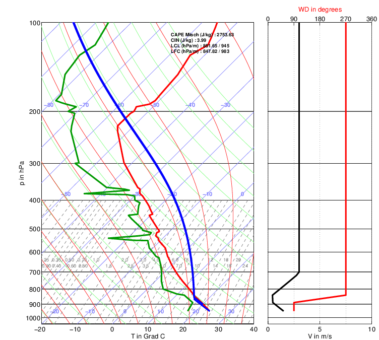
I'm looking into Charts as a solution for building a specialized data display that requires the X-axis plotting to be done on a rotated skew, and the Y-axis in logarithmic space. An example of what I'm referring to is below.
In this example image, pressure decreases with increasing Y axis values on a logarithmic scale, but the difficult part is the temperature and dew point lines (red and green, respectively), are plotted on a skew of a 45 degree angle. That is to say, constant temperature is represented by a line intersecting a constant Y axis value at a 45 degree angle rather than a 90 degree angle.
Is there a means or way to access the underlying drawing API to either skew the axis, or a way to create a custom class that would accomplish this? Or is Charts not quite suited for this kind of task? I've tried to do some documentation digging, and I can't see any methods that do this immediately. Not looking for someone to write it for me, but if there's a way to create a child chart class where I can customize how the line gets drawn with some constant offset, that would work too. Just need to be pointed in the right direction.
Contributor guide
Research direction
Start by reviewing Charts' documented chart, axis, and drawing APIs for support for a rotated or skewed X axis and logarithmic Y axis. Determine whether a custom chart class or underlying drawing API can provide the requested geometry; done would be a documented extension point or a clear confirmation that Charts cannot support it.
Written by the indexing model from the issue text.
Assessment
- Tech stack
- swift
- Domain
- data-visualization
- Issue type
- Feature
- Difficulty
- 5/5
- Estimated time
- Over a week
- Activity status
- Stale
- Clarity
- Needs clarification
- Newbie friendliness
- 25/100