Add Axis titles by SwiftUI "overlay" as a workaround.
- Dominant language
- Swift
- Stars
- 28k
- Forks
- 6k
- PR merge metrics
- No merged PRs in 30d
Description
* [x] I've read, understood, and done my best to follow the [*CONTRIBUTING guidelines](https://github.com/jjatie/Charts/blob/master/CONTRIBUTING.md).
## What did you do?
Try to add axis titles in SwiftUI. I could not find any builtin method or way with Charts to add axis labels. BTW, scientific charts MUST have axis titles or they will be rejected by any reviewer.
## What did you expect to happen?
A simple xAxis method to add a text as an axis title that describes what the axis values represent and their unit.
## What happened instead?
Nothing ;-)
Therefore, I used the [SwiftUI overlay function](https://developer.apple.com/documentation/swiftui/hstack/overlay(_:alignment:)) for Views to add my axes titles:
... see workaround below in section "Demo Project".
## Charts Environment
**Charts version/Branch/Commit Number: 3.5.0**
**Xcode version: 11.5**
**Swift version: 5**
**Platform(s) running Charts: iOS**
**macOS version running Xcode: 10.15.5**
## Demo Project
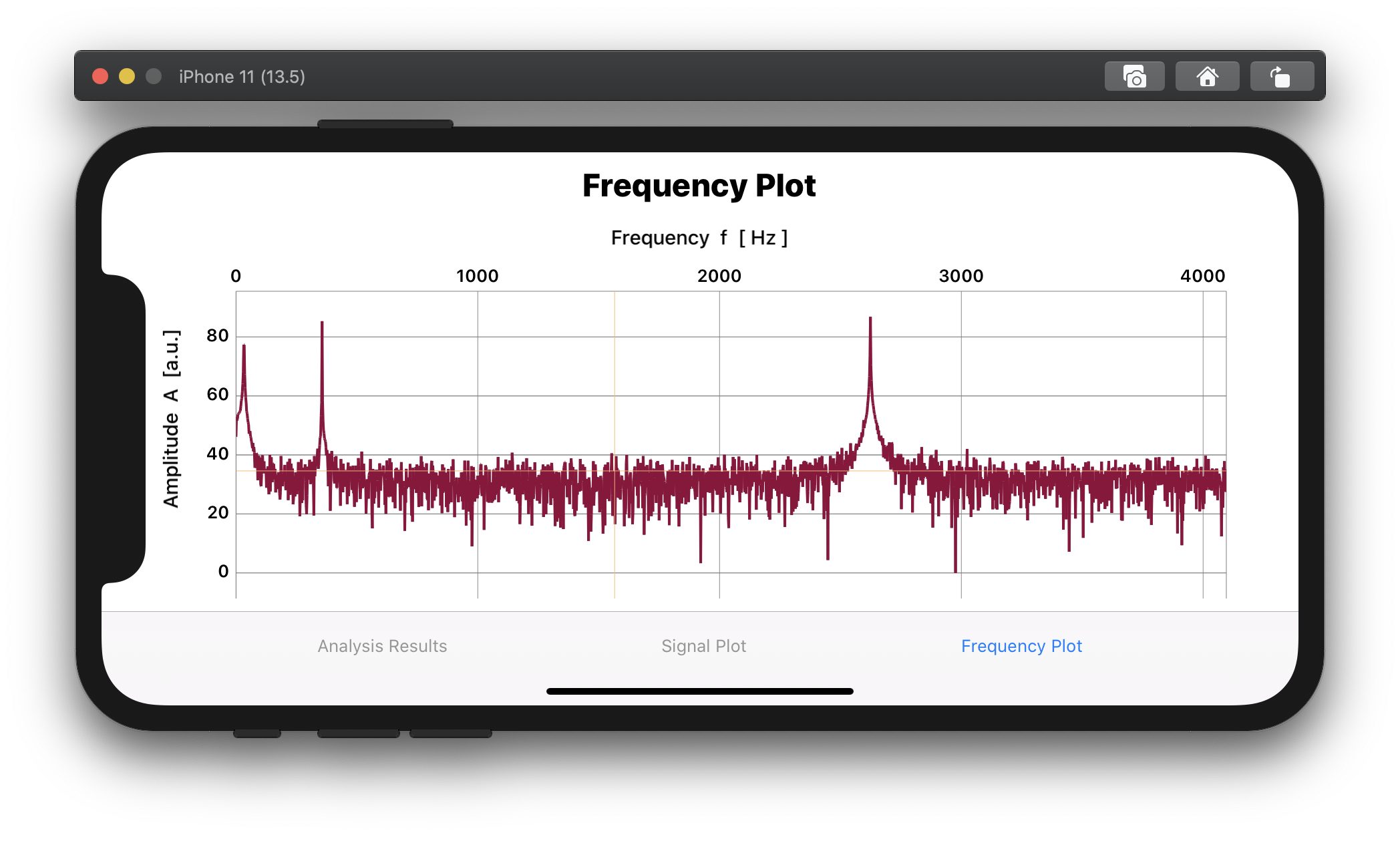
The "LinePlot()" structure returns a SwiftUI View with a single line graph, with variables for the x and y data as well as for the line color. The content of this view is actually irrelevant. Thanks to [Evgeny Basisty for his tutorial](https://medium.com/@zzzzbh/plotting-in-ios-using-charts-framework-with-swiftui-222034a2bea6) on how to use Charts with SwiftUI.
Now, by using _.padding_, _.offset_, and _alignment_, one can adjust the exact position of the axes titles.
My Code to "solve" this issue:
LinePlot(entries: populateXYCharData( xvec: myXData, yvec: myYData ) , mylinecolor: [UIColor(#colorLiteral(red: 0.5725490451, green: 0, blue: 0.2313725501, alpha: 1))] )
.padding(.top, 30 )
.padding(.leading, 30)
.overlay(Text("Amplitude A [a.u.]")
.font(.system(size: 15))
.fontWeight(.medium)
.rotationEffect(.degrees(270))
.offset(x: -60.0, y: 0.0),
alignment: .leading)
.overlay(Text("Frequency f [ Hz ]")
.font(.system(size: 15))
.fontWeight(.medium)
.offset(x: 0, y: 0),
alignment: .top)
Example of a frequency plot from an FFT analysis:
Contributor guide
Research direction
No source files, tests, or entry points are named. Start by locating the SwiftUI axis configuration and existing axis-label APIs, then define how x- and y-axis titles should be exposed and positioned without the overlay workaround. Done means a documented axis-title API that supports labels and units on both axes.
Written by the indexing model from the issue text.
Assessment
- Tech stack
- swift
- Domain
- mobile
- Issue type
- Feature
- Difficulty
- 5/5
- Estimated time
- Over a week
- Activity status
- Stale
- Clarity
- Mostly clear
- Newbie friendliness
- 30/100