Recalculating the Y Axis to automatically align data in front of label?
- Dominant language
- Swift
- Stars
- 28k
- Forks
- 6k
- PR merge metrics
- No merged PRs in 30d
Description
> ℹ Please fill out this template when filing an issue.
> All lines beginning with an ℹ symbol instruct you with what info we expect. You can delete those lines once you've filled in the info.
>
> Per our [*CONTRIBUTING guidelines](https://github.com/jjatie/Charts/blob/master/CONTRIBUTING.md), we use GitHub for
> bugs and feature requests, not general support. Other issues should be opened on Stack Overflow with the tag [`ios-charts`.](https://stackoverflow.com/questions/tagged/ios-charts)
>
> Please remove this line and everything above it before submitting.
* [ ] I've read, understood, and done my best to follow the [*CONTRIBUTING guidelines](https://github.com/jjatie/Charts/blob/master/CONTRIBUTING.md).
## What did you do?
Mapped the API data to the X and Y axis and hard coded Y axis min and max values to 0 and 100 respectively.
## What did you expect to happen?
The Y axis grid lines should have been in front of the label without truncating the min and max values.
## What happened instead?
Data is getting mapped with the Y grid lines offset and alignment of line is distorted.
## Charts Environment
**Charts version/Branch/Commit Number:** 3.1.1
**Xcode version:** 9.4
**Swift version:** 4.2
**Platform(s) running Charts:** iOS
**macOS version running Xcode:**
## Demo Project
ℹ Please link
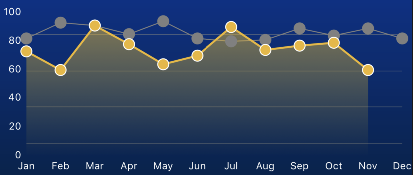
to or upload a project we can download that reproduces the issue.
Contributor guide
Research direction
No source file, test, or reproducible demo project is named; begin by reproducing the iOS chart using the reported API data, fixed Y-axis range of 0–100, and the attached screenshot as the visual reference. Done means the Y-axis grid lines align with the labels without truncating the minimum or maximum values and the plotted line is no longer distorted.
Written by the indexing model from the issue text.
Assessment
- Tech stack
- swift
- Domain
- data-visualization, mobile-dev
- Issue type
- Bug
- Difficulty
- 4/5
- Estimated time
- 3-5 days
- Activity status
- Stale
- Clarity
- Needs clarification
- Newbie friendliness
- 28/100