Wrong number of label on X axis of line chart when there is only one data entry
- Dominant language
- Swift
- Stars
- 28k
- Forks
- 6k
- PR merge metrics
- No merged PRs in 30d
Description
Every thing works fine with line chart when I have more than one data entry. However, when I only have one data entry, something wrong with the label of x axis.
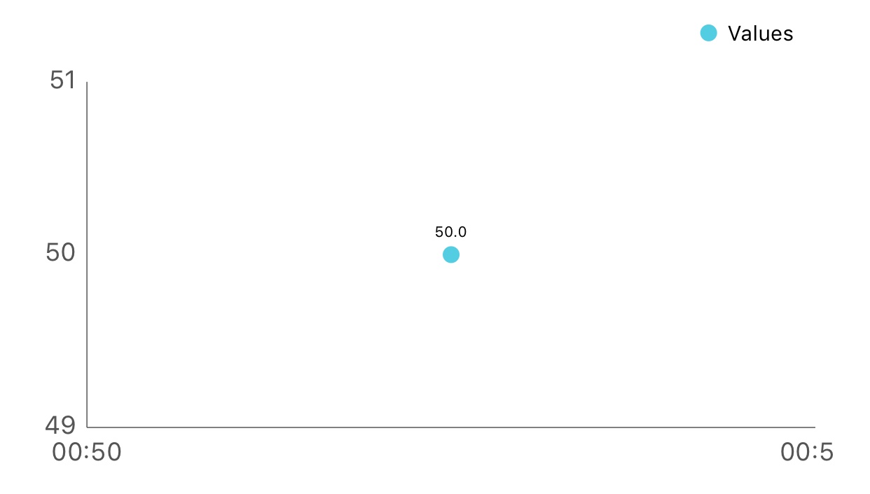
What I want is only show one label and align it to the data point.
I've tried the setting below but none of them work.
`chartView.xAxis.granularityEnabled = true`
`chartView.xAxis.granularity = 1`
`chartView.xAxis.setLabelCount(1, force: true)`
I've also tried to set minimum and maximum value of x axis with -1 to 1, 0 to 1, and even 0 to 0. But still didn't work :(
Is there any way to correctly show the label?
## Charts Environment
Charts version/Branch/Commit Number: 3.1.1
Xcode version: 9.2
Swift version: 4.0
Platform(s) running Charts: iOS
macOS version running Xcode: 10.2.6
Contributor guide
Research direction
No source file or test is named. Reproduce the issue with a one-entry line chart on iOS, then trace the x-axis label generation and compare it with a chart containing multiple entries. Done means exactly one x-axis label is shown and aligned with the data point.
Written by the indexing model from the issue text.
Assessment
- Tech stack
- ios, swift
- Domain
- data-visualization, mobile-dev
- Issue type
- Bug
- Difficulty
- 3/5
- Estimated time
- 1-2 days
- Activity status
- Stale
- Clarity
- Mostly clear
- Newbie friendliness
- 38/100