Adding a new entry on a line chart (in between existing entries) causes chart to behave weird.
- Dominant language
- Swift
- Stars
- 28k
- Forks
- 6k
- PR merge metrics
- No merged PRs in 30d
Description
I am trying to create a chart in which entries can be added and removed dynamically.
The problem I'm facing is that when I add new entries at a smaller xAxis value than the previously existing entries, they graph reflects random lines.
If I add a new entry where the xAxis value is bigger than the previous values, it works perfectly. Deleting existing entries is also working fine.
Following are the steps with screenshots:
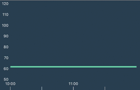
Step 1. **Initial chart**
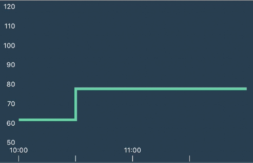
Step 2. **Adding a value at 10.30**
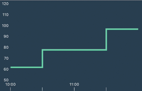
Step 3. **Adding a value at 11.30**
Step 4. **Now when I add a new value at 11.00, since the dataSet already has a value for 11.30, the graph starts showing random output.**
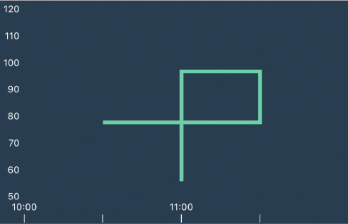
Now when I delete this value which I added last, the chart becomes accurate again.
I could clear the values altogether and create a whole new data set whenever a new entry is to be added but that's just unnecessary iterations over the data which has to be shown. Since there are methods to add entries to the chart, I assume there is a way to add entries in between existing ones.
Could you please guide me towards how could I achieve the required behaviour?
Thanks in advance!
## Charts Environment
**Charts version/Branch/Commit Number: *3.1.1*
**Xcode version: *9.4*
**Swift version: *4.1*
**macOS version running Xcode:*10.13.4*
Contributor guide
Assessment
This issue has not been assessed yet.