Azure / Azure/api-management-developer-portal
Subscription widget - several UX issues
- Dominant language
- TypeScript
- Stars
- 545
- Forks
- 360
- PR merge metrics
- No merged PRs in 30d
Description
#577 Bug description / expected behavior
**(1) Problem: Button styles and states (without activated terms of use)**
In the default/reset version of the portal there are two button styles. The first for the AAD button and the second for the sign-in & subscribe button.
_Image "Button settings on the style page of the default portal":_
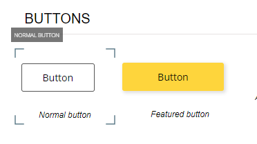
_Image "Button design of the default portal sign in page":_
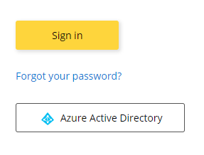
_Image "Button design on the default subscription widget":_

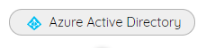
My customized button styles behave very weird for the AAD button and the Subscribe button. I am not able to define the styles of these buttons separately on the styles sheet of the portal.
_Image: "Button settings on the style page of the customized portal":_
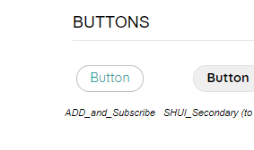
_Image "Button design of the AAD button of the customized Sign in page":_
API consumer complaint that they did not see that the button got activated after entering text into the input form field. The problem is that if I change my current button settings for the "default" state also the default design of the AAD button on my sign in page gets changed. But I only want to change the design of the subscription button.
It seems that in the case that the terms of use option is not active, when the subscription name has been entered to the input form field that the button state is "default" instead of the expected "active" button status in this context.
If the terms of use option is activated the button states seem to fit better. I tested this on the default portal pages after activating the terms of use option.
**Expected behavior:**
- The button styles can be independently defined for the AAD button and for the Subscribe button via the styles configuration page of the portal
(currently in my set-up this is not possible - seems that one button item disappeared).
- If text is entered into the input form field and no terms of use are activated the button status should be "active" and not "default". In this case I like to highlight the button that it is more obvious to the user that the button is now ready to be pressed.
_Image: "Button design on the customized subscription widget (disabled state)":_
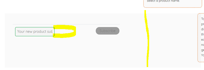
_Image: "Button design on the customized subscription widget (default state)":_

**(2) Problem: Distance between input form and button to high (without activated terms of use)**
We have not yet activated the terms of use for most of our APIM environments. This might change this in future for the production environments.
If the subscription widget is displayed with deactivated terms of use the distance between the input form field and the subscription button is much too big. API consumer complaint that it is hard to recognize that the two items belong together, especially as the button gets only activated when entering the required display name. With the current button style issues it was more worth. I already added a grey background color to the subscription section/block to signalize that the whole block including the button belongs together.
_Image "Distance between input form field and button on the default subscription widget with terms of use":_

_Image "Distance between input form field and button on the customized subscription widget w/o terms of use":_
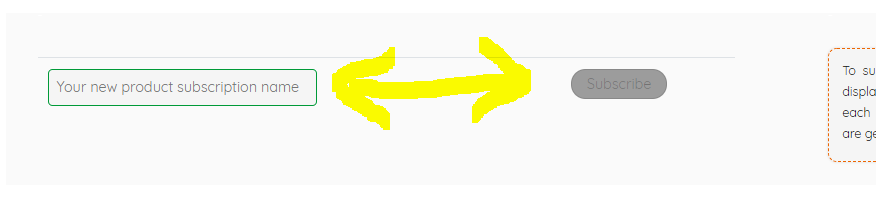
**Expected behavior:**
If the terms of use are not activated for a requirement, the length of the input form field must be extended as much as possible so that the button is much closer to the input field on the left.
**(3) Problem: People do not understand that a display name has to be mandatorily added to request a subscription**
It is not obvious and understandable for the API consumer that a subscription name has to be entered first before the Subscription button gets activated to request a subscription.
_Image "Subscription widget on customized portal page without terms of use":_
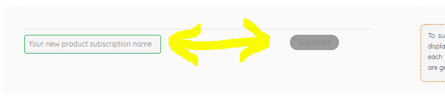
**Expected behavior:**
Provide a tooltip with a help text when people hover over the subscribe button or if they try to press the disabled "Subscribe" button. The tooltip should also give a hint why an individual display name is required to request the "Subscribe".
**(4) Problem: Responsiveness is weird**
The columns section/block with and without the subscription widget currently behave differently when reducing the window width. The right columns on my page is currently not correctly aligned for dedicated window resolutions! It looks very unprofessional for such resolutions
Image "Subscription widget on customized portal page with lower window resolution":
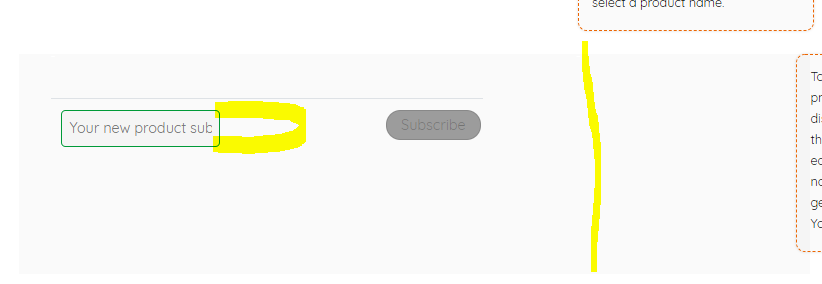
As a workaround, I rearranged the page elements. But different page arrangements should work without problems as well.
**Expected behavior:**
For each section/block with similar column settings, the columns should be kept aligned and the responsiveness behavior should be consistent.
**(5) Problem: Loading performance of the widget slow**
When loading a page with the embedded subscription widget, the content of the subscription widget is loaded VERY slowly in comparison to the rest of the page. For seconds, you see loading symbol in the widget until this information is loaded. The rest on this page is loaded much quicker.
_Image "View when loading a customized portal page with the subscription widget":_
**Expected behavior:**
Speed up the loading performance for the contents of the subscription widget to less than 1 second / without a meaningful delay.
**(6) Problem: Color of the AAD icon that is displayed within the AAD button is not fitting to our corporate design colors**
Currently we chose a grey background color for the AAD button. But I got already the feedback that the visibility of the AAD button of the Sign in page should be improved. Our corporate design colors consider such signal colors, but the the colors to not work with the predefined blue AAD icon in the button!
**Expected behavior:**
Remove this blue icon from the AAD button or make it configurable if you wish to remove it.
Or on the styles sheet create a separate style item for the AAD button that is named accordingly that allows to display or hide the blue AAD icon in the button.
## Environment
- Managed
- Operating system: Windows 10
- Browser: Chrome latest
Contributor guide
No contributing guide indexed for this repository
Research direction
No files, tests, or entry points are identified. First separate and scope the six reported subscription-widget problems with the maintainers; completion would require explicit acceptance criteria and verification for each selected issue.
Written by the indexing model from the issue text.
Assessment
- Tech stack
- typescript
- Domain
- frontend
- Issue type
- Bug
- Difficulty
- 5/5
- Estimated time
- Over a week
- Activity status
- Stale
- Clarity
- Needs clarification
- Newbie friendliness
- 20/100