Suggested new job visualization
- Dominant language
- TypeScript
- Stars
- 205
- Forks
- 75
- PR merge metrics
- No merged PRs in 30d
Description
An idea for a visualization to allow a user to view the progress of a job over time - here's a mockup I drew (badly!) on a whiteboard:
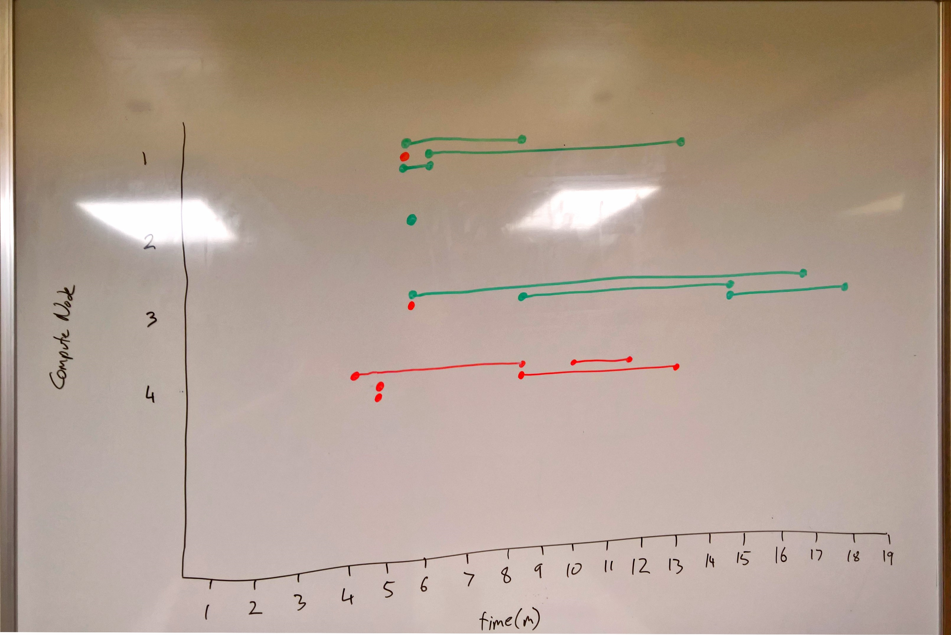
Time flows from left to right on the x-axis; All of the compute nodes are listed on the y-axis.
Tasks
* appear as lines, vertically aligned with the relevant compute node
* horizontally they trace their execution time
* colour coded by success/failure
Interactions
* Click on compute node to go to a detail page
* Click on a task to go to that task
* Zoom in to see details (perhaps show task ids within the bars?), pan left/right/up/down
What does this visualization show?
* Pool utilization - whitespace shows if the user getting maximum value from their pool, or is there a lot of idle time
* Problem nodes - if every task fails on a particular node (see #4 in the image above), that node might need checking.
* Overloads - if a tasks on a node take much longer to run than everywhere else, that node might have need checking
* Problem times - if every active task fails at the same time, might point to an external issue (throttling, storage, network connectivity, etc)
Issues to consider
* Should we show dependencies?
* How to handle jobs with thousands of tasks?
Contributor guide
Assessment
This issue has not been assessed yet.