Automattic / Automattic/wp-calypso
FSE: Streamline the toggles in the block editor settings
- Dominant language
- TypeScript
- Stars
- 12.6k
- Forks
- 2k
- Avg merge
- 1d 17h
- Merged PRs (30d)
- 552
Description
### What
There should be some consistency in the buttons used to toggle the options in the settings for Blocks.
There are three types of toggles:
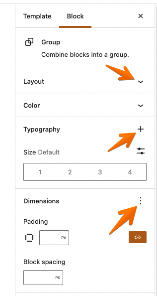
1. down chevron
2. plus sign
3. three vertical dots
### Why
It is not intuitive. How can a user visually know the reason for three different buttons, and given that this is new and being rolled out to customers that may be new to website building as well, the clearer things can be, the better. They should all symbolise the same thing: 'click for more options'. It is unnecessary to make a distinction if it is also unclear.
### How
All of them should be plus signs. I've edited the previous screenshot to the way that I suggest it should work instead.
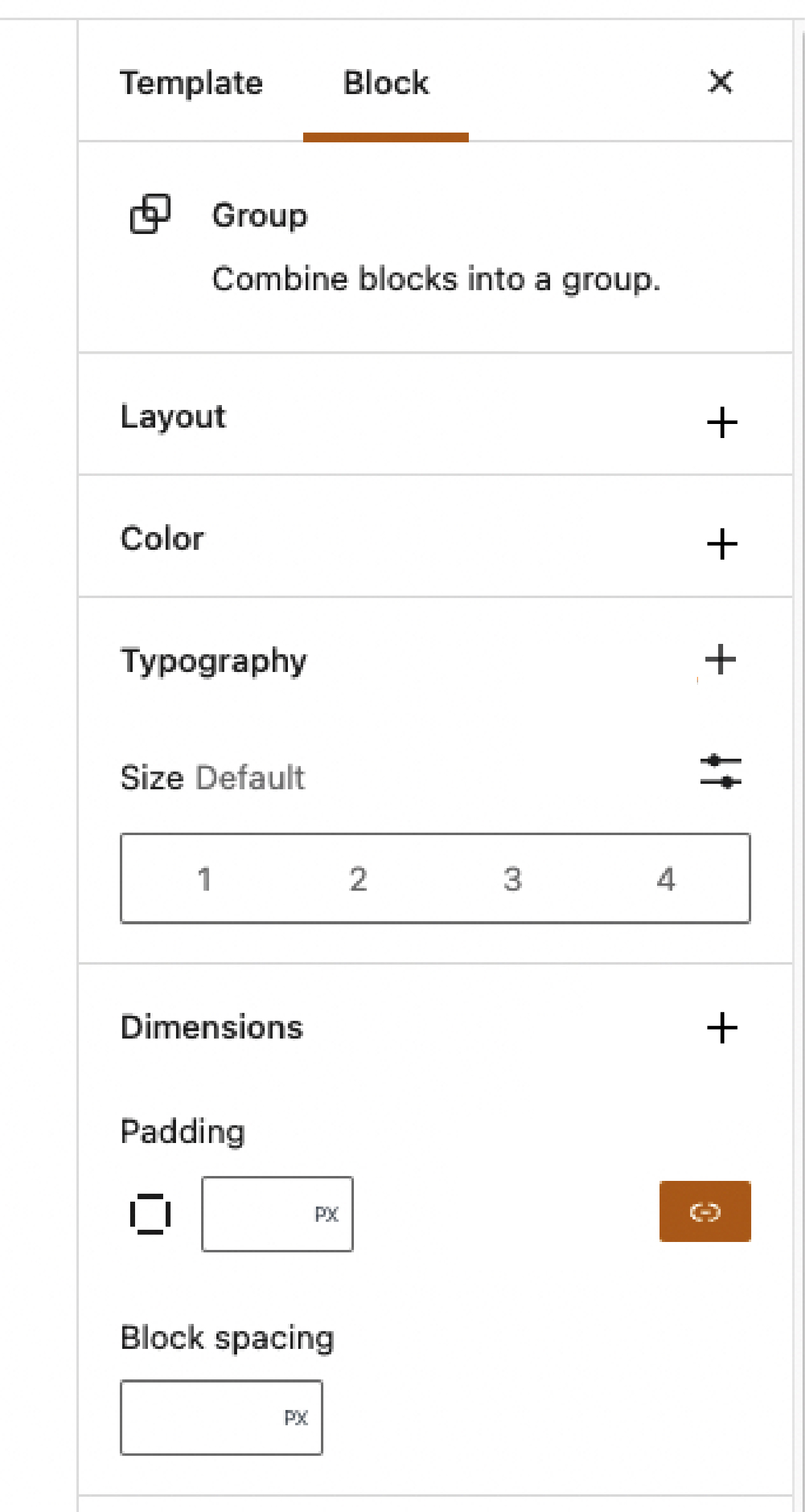
.
Contributor guide
Research direction
Start by locating the block editor settings and inspecting the three toggle styles shown in the issue screenshots: down chevron, plus sign, and vertical dots. The work is done when each of these options uses a plus sign consistently; the issue does not name files or tests, so finding the relevant settings components is the first step.
Written by the indexing model from the issue text.
Assessment
- Tech stack
- react, typescript
- Domain
- design, frontend
- Issue type
- Feature
- Difficulty
- 3/5
- Estimated time
- 1-2 days
- Activity status
- Stale
- Clarity
- Mostly clear
- Newbie friendliness
- 42/100