Automattic / Automattic/simplenote-electron
Tab focus highlights in dark mode are a bit jarring
- Dominant language
- TypeScript
- Stars
- 5.3k
- Forks
- 588
- Avg merge
- 9h 45m
- Merged PRs (30d)
- 4
Description
I'm not sure if this is intended or if there's any way to avoid it (maybe by not focusing anything by default, but waiting until a Tab or other navigation key is pressed?) but these don't look great to me.
Additionally, only on Electron (not in the browser), the note list ones light up every time you click on a different note in the notes list.
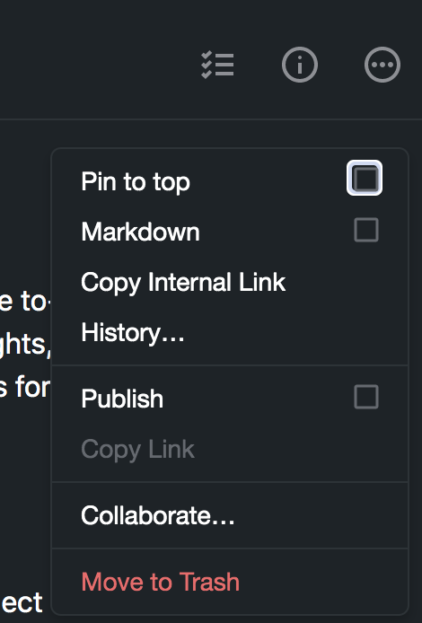
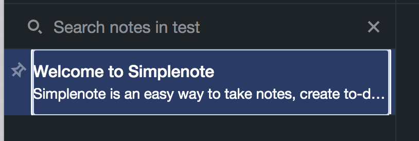

Does this seem like the right behavior? cc @dcalhoun as our a11y expert :)
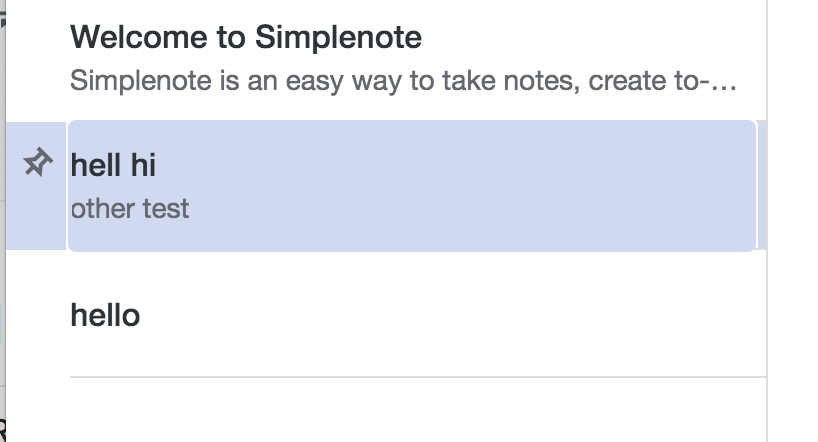
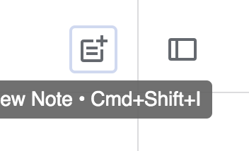
They look better in light mode fwiw, more subtle:

Contributor guide
Research direction
Reproduce the focus highlights in dark mode in both the browser and Electron, including clicking different notes in the note list and navigating with Tab. Review the expected accessibility behavior before deciding what should change; done means the focus indication is intentional, usable, and visually appropriate in both environments.
Written by the indexing model from the issue text.
Assessment
- Tech stack
- electron, typescript
- Domain
- accessibility, design, desktop, frontend
- Issue type
- Bug
- Difficulty
- 4/5
- Estimated time
- 3-5 days
- Activity status
- Stale
- Clarity
- Needs clarification
- Newbie friendliness
- 25/100