Automattic / Automattic/jetpack
Instant Search: Add some contrast or separation to results on mobile
- Dominant language
- PHP
- Stars
- 1.8k
- Forks
- 898
- Avg merge
- 1d 18h
- Merged PRs (30d)
- 774
Description
### Impacted plugin
Jetpack, Search
### What
In mobile views, it could be clearer which result a given image belongs to.
### How
Currently our mobile results look like this:
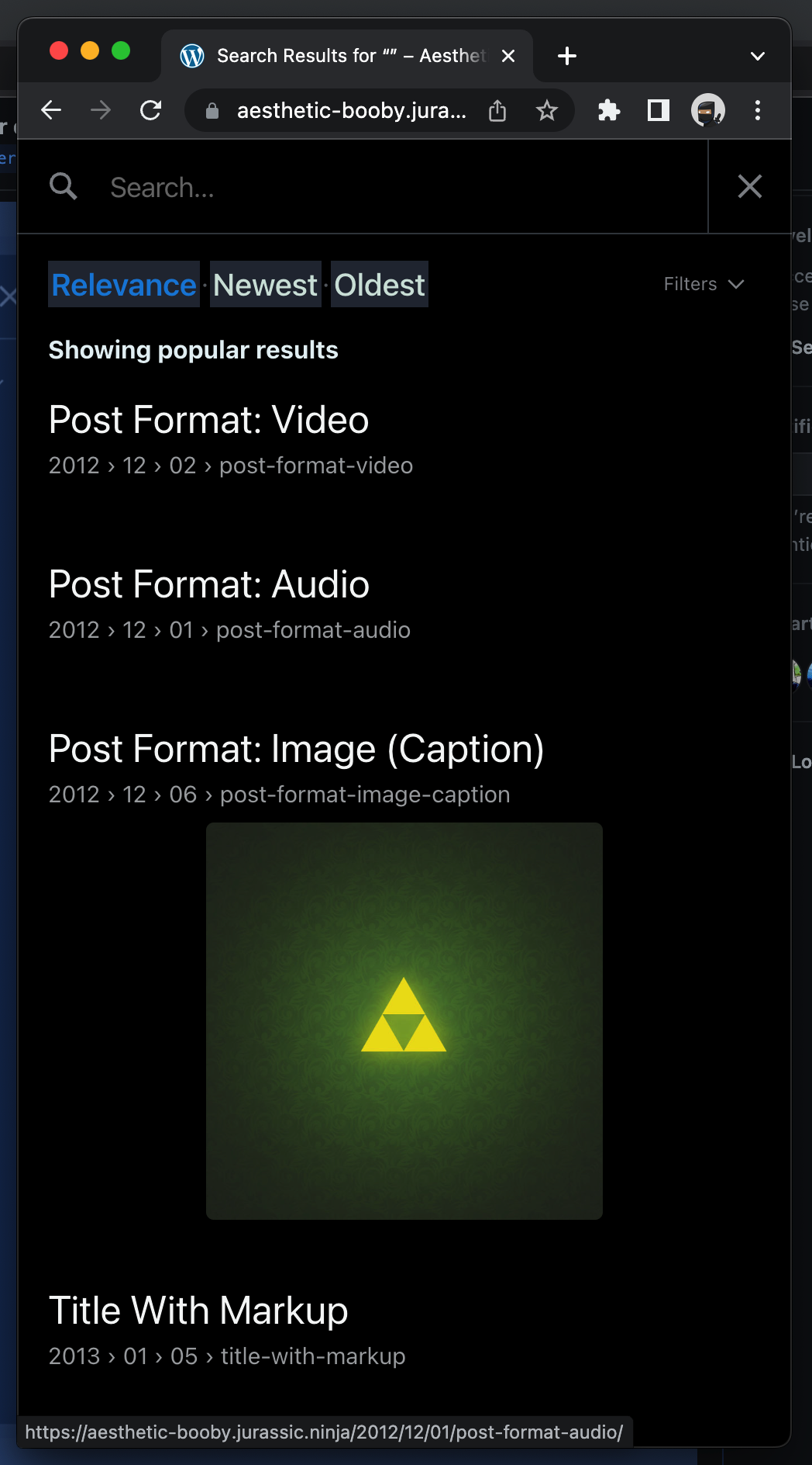
It would be nice if the post/image association was a bit clearer. Two possible options are:
1. To increase the spacing between the image and the following result.
2. To alternate the background colour slightly (like is commonly seen in tables) to delineate results.
I'd personally favour the second option as space is already at a premium on mobile screens.
Contributor guide
Research direction
Start by reviewing the Instant Search mobile results shown in the issue screenshot and reproduce the current layout on a mobile viewport. Compare increased spacing with alternating background colours, then confirm that each image is clearly associated with its post without wasting excessive screen space.
Written by the indexing model from the issue text.
Assessment
- Domain
- frontend, mobile
- Issue type
- Feature
- Difficulty
- 3/5
- Estimated time
- 1-2 days
- Activity status
- Stale
- Clarity
- Mostly clear
- Newbie friendliness
- 35/100