Automattic / Automattic/jetpack
Enhancement: Improve visual design of payment block selector
- Dominant language
- PHP
- Stars
- 1.8k
- Forks
- 898
- Avg merge
- 1d 18h
- Merged PRs (30d)
- 774
Description
### Impacted plugin
Jetpack
### What
The payments block selector could be nicer
### How
The payments block selector currently looks like this:
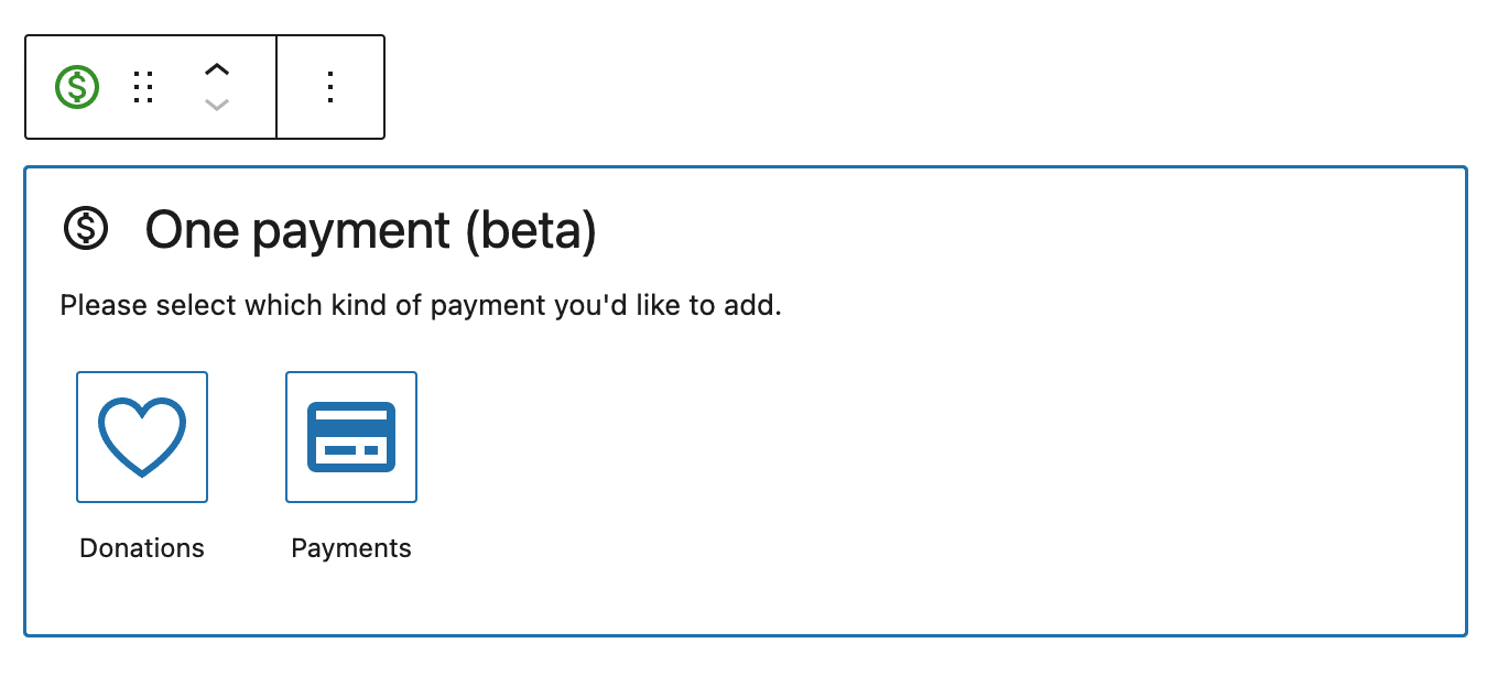
There are some more involved designs floating around, see pcbrnV-3OB-p2 and links from it but perhaps there are some quicker wins like aligning the choices differently, or displaying the tooltip in a more prominent location.
The component used is the [BlockVariationPicker](https://github.com/WordPress/gutenberg/search?q=BlockVariationPicker&type=issues), so perhaps work would make more sense there.
Contributor guide
Research direction
Start by reviewing the BlockVariationPicker component and the pcbrnV-3OB-p2 design reference mentioned in the issue. The work is done when the payment block selector has an agreed, visibly improved layout or tooltip treatment, but the issue does not define a specific design or acceptance criteria.
Written by the indexing model from the issue text.
Assessment
- Tech stack
- javascript, react
- Domain
- design, frontend, payments
- Issue type
- Feature
- Difficulty
- 5/5
- Estimated time
- Over a week
- Activity status
- Stale
- Clarity
- Needs clarification
- Newbie friendliness
- 25/100