Automattic / Automattic/jetpack
Map Block: marker content style overwritten by theme design
- Dominant language
- PHP
- Stars
- 1.8k
- Forks
- 898
- Avg merge
- 1d 18h
- Merged PRs (30d)
- 774
Description
#### Steps to reproduce the issue
1. Start on a site running a theme like Twenty Twenty.
2. Under Appearance > Customize, pick a black background color.
3. Go to Pages > Add New and add a Map block. Add a basic marker, no custom colours.
4. When you view the page, you'll see that the marker popup has quite a few layout issues:
- The marker heading margins are overwritten by Twenty Twenty styles, adding a lot of margin.
- The marker close button is impacted by Twenty Twenty styles.
- You can't actually see the marker's content because its color is set to white.
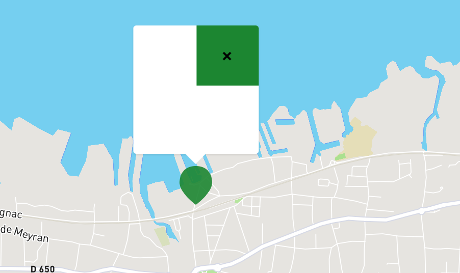
Maybe we should add super specific styles for that popup so it does not get broken by themes?
Another approach would be not to change anything if we want themes to be in full control, but maybe in this case we should add some custom rules to our Twenty Twenty compat CSS file?
https://github.com/Automattic/jetpack/blob/eefec2085242c33c490d0da3fda82d86d1f06bc7/modules/theme-tools/compat/twentytwenty.css
Contributor guide
Research direction
Start by reproducing the Map block marker popup with Twenty Twenty and a black background, then inspect modules/theme-tools/compat/twentytwenty.css. Compare the heading margins, close button, and content color against the issue screenshot. Done means the chosen compatibility approach prevents these theme styles from breaking the popup.
Written by the indexing model from the issue text.
Assessment
- Tech stack
- css, wordpress
- Domain
- design, frontend
- Issue type
- Bug
- Difficulty
- 3/5
- Estimated time
- 1-2 days
- Activity status
- Stale
- Clarity
- Mostly clear
- Newbie friendliness
- 35/100