Automattic / Automattic/WP-Job-Manager
Add CSS for cleaner look of job_salary field
- Dominant language
- PHP
- Stars
- 899
- Forks
- 369
- Avg merge
- 11h 37m
- Merged PRs (30d)
- 12
Description
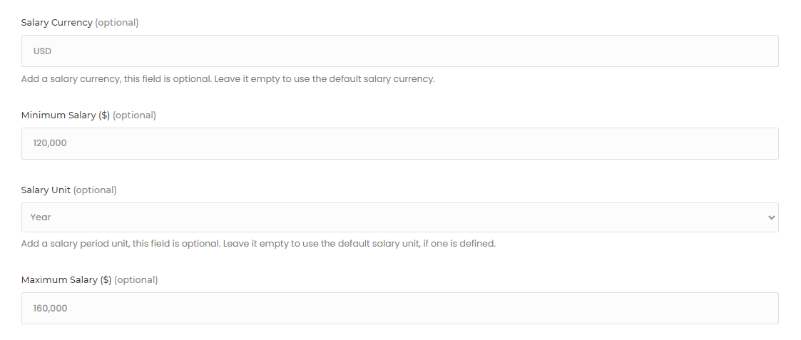
Had a client bring this up, and I do agree with them, I think it would be good for us to add some CSS to set the salary fields to show on the same line (stack when on mobile with media queries), as this is how it currently looks (sorta there was a "max" field added):
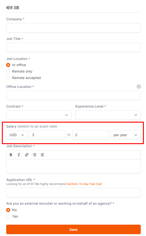
This would make it look much cleaner (something along these lines):
Contributor guide
Research direction
Start by locating the job_salary markup and the existing stylesheet that controls the salary fields. Compare the current layout with the supplied screenshots, then verify that the fields share a line on wider screens, stack on mobile, and retain the requested appearance.
Written by the indexing model from the issue text.
Assessment
- Tech stack
- css
- Domain
- frontend
- Issue type
- Feature
- Difficulty
- 2/5
- Estimated time
- 1-3 hours
- Activity status
- Stale
- Clarity
- Mostly clear
- Newbie friendliness
- 48/100