ArduPilot / ArduPilot/MissionPlanner
Log Analyses Graph breaks when adding too many CurveItems to be shown
- Dominant language
- C#
- Stars
- 2.4k
- Forks
- 2.9k
- Avg merge
- 19h 16m
- Merged PRs (30d)
- 4
Description
#### Issue details
Steps to reproduce:
1. Run the application
2. Select "Telemetry Logs" CTA when the MissionPlanner GUI loads
3. Select the "Tlog > Kml or Graph" CTA
4. Load in a tlog file by clicking on the "Graph Log" CTA and selecting the tlog file
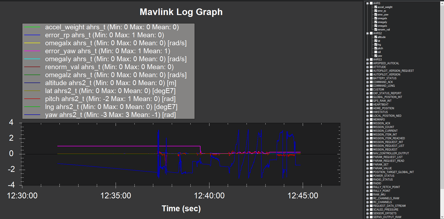
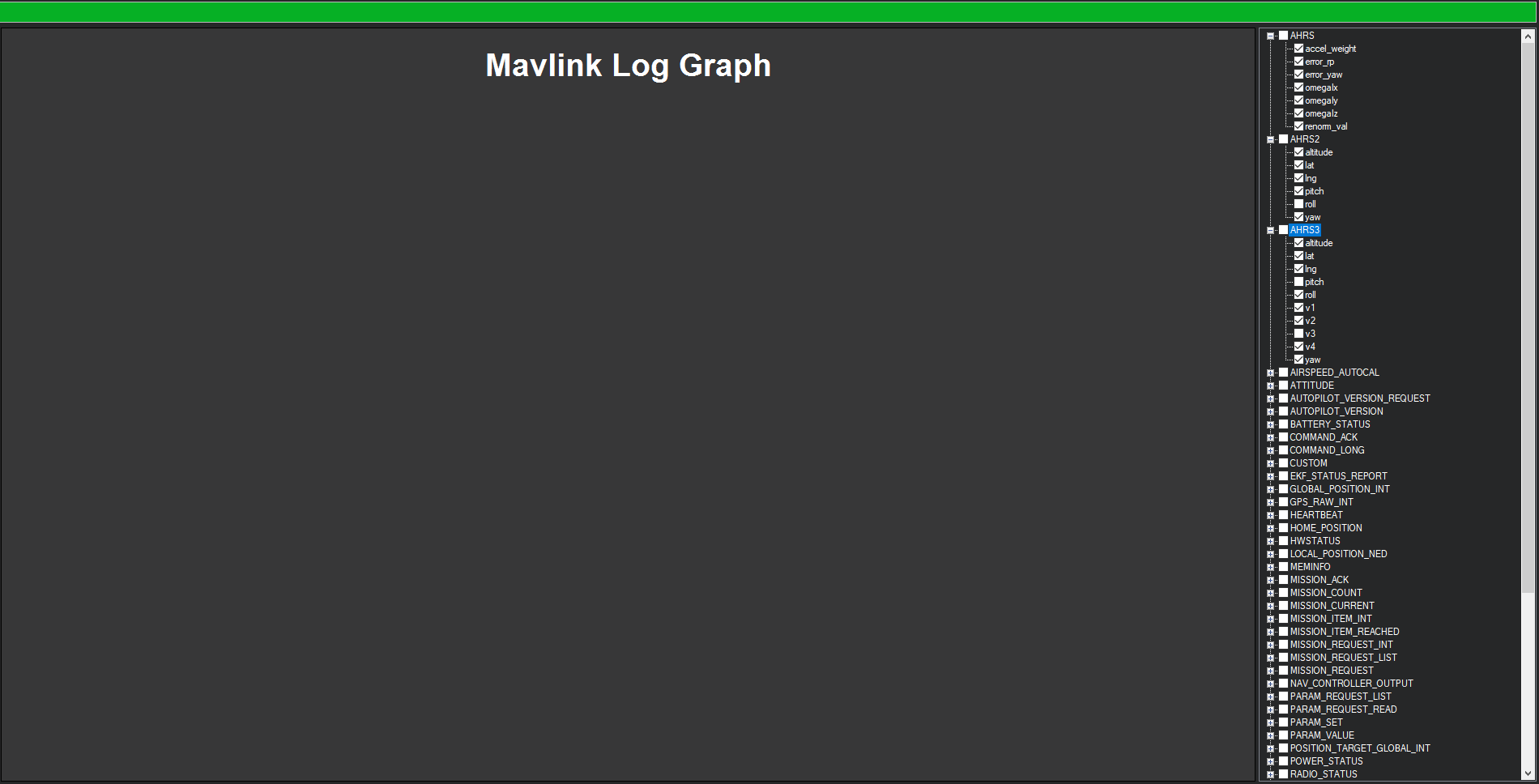
5. Notice that when clicking a large amount of CurveItems to be displayed (by checkmarking the right hand elements), the graph gets quite smaller and eventually dissapears.
Expected results: There should be a nicer way to handle listing CurveItem elements and their information without making the graph unreadable. My team's idea is to only have the GUI show 4 or so elements (so that the graph is still nicely proportioned) and to add a scrolling feature to see which CurveItems are being displayed.
Actual results: Adding to many CurveItems to the Log Analyses graph makes the graph unpleasant to read and also eventually makes the graph dissappear if selecting enough elements
Processor: Intel Core i7-3630QM CPU @ 2.40 GHZ
RAM: 8 GB
System type: 64-bit Operating System
OS: Windows 10
Notes:
#### Version
1 parent 7d3286e commit 12f6beea15233afac13b7c48d14238d347ad6a3d
#### Platform
[ ] All
[ ] AntennaTracker
[ ] Copter
[ ] Plane
[ + ] Rover
[ ] Sub
#### Airframe type
NA, will update this section on Tuesday 12/4/2018 with the correct information.
#### Hardware type
NA, will update this section on Tuesday 12/4/2018 with the correct information.
#### Logs
.tlog file is not supported
Contributor guide
No contributing guide indexed for this repository
Research direction
Reproduce the problem through the MissionPlanner GUI's “Telemetry Logs” and “Tlog > Kml or Graph” CTAs, then load a tlog and select many CurveItems. Inspect the Log Analyses graph and its CurveItem list. Done means selecting many items no longer makes the graph unreadable or disappear, with a usable way to view the selected items.
Written by the indexing model from the issue text.
Assessment
- Tech stack
- csharp
- Domain
- data-visualization, desktop
- Issue type
- Bug
- Difficulty
- 4/5
- Estimated time
- 3-5 days
- Activity status
- Stale
- Clarity
- Mostly clear
- Newbie friendliness
- 35/100