AdguardTeam / AdguardTeam/AdGuardDNS
Make blocklist section headings more obvious
- Langage dominant
- Go
- Étoiles
- 952
- Forks
- 82
- Métriques de merge des PR
- Aucune PR mergée en 30 j
Description
### Issue Details
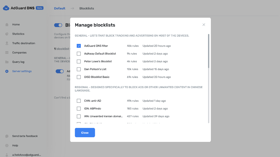
The new changes to the blocklist selection page make it a bit of a chore to scroll through the filter list due to the space each filter takes up on a mobile device.
On an iPhone 13, only 2 filters are visible at a time, with the filter list being quite long.
### Proposed solution
It’s common to have a compact view and a comfy view in apps, an example of this is MS Teams.
My solution would be to bring back the old view which is more readable on mobile devices, allowing the user to choose between the two views.

### Alternative solution
_No response_
Guide de contribution
Aucun guide de contribution indexé pour ce dépôt
Évaluation
Cette issue n'a pas encore été évaluée.